Online music services with killer UI
Music streaming increased by 54 per cent in 2014 compared to the previous year's figure and this robust growth is expected to continue as more and more services become available.
Digital music sales appear to be in the midst of a steep decline with sales of digital albums falling by 9 per cent in 2014 compared to 2013 figures while sales of digital songs fell 12 per cent over the same period.
One of the main reasons for these numbers is the emergence of digital streaming services which enable you to get the music you want for a small monthly fee; it is even possible to get free music as long as you can cope with the advertising you would need to endure.
Music streaming increased by 54 per cent in 2014 compared to the previous year's figure and this robust growth is expected to continue as more and more services become available.
Users seem to view these services in the same way as people view sports teams; each individual has a service they rate above all others and as the competition heats up, we have decided to take a look at 6 of the top rated music streaming services while paying attention to the user interface on each...
01. Spotify: the overachiever
With anywhere from 40-60 million users depending on the figures you believe, Spotify remains the streaming service of choice for most music lovers.
A combination of the low price tag and 25 million song catalog makes Spotify hard to resist while its social integration with Facebook enables you to share songs with your friends.
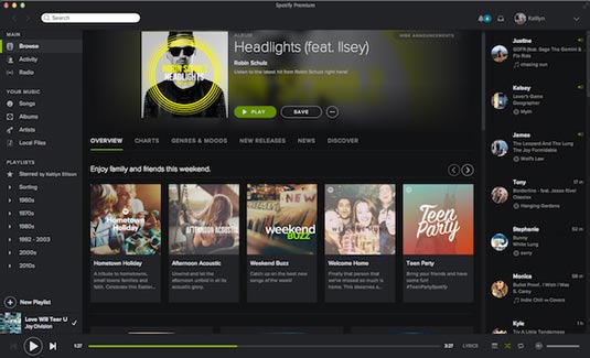
Spotify's UI can take a little time to figure out
It can take a little time to figure out the UI but once you do, it's an enjoyable experience. The site cleverly combines a darker background with a lime green for activity while all four sides of the page have the most commonly used features and is divided into:
- An area for your playlists and library
- An activity feed for the accounts you follow
- The music player
- Personal notifications and your profile
02. Rdio: the minimalist
Rdio is similar to Spotify insofar as it allows for free usage if you don't mind adverts and it has a catalog of around 20 million songs while also allowing for social media integration.
While it doesn't have as large a community as Spotify, it is actually easier to navigate. This is mainly due to its minimalist design which features a list of suggestions against a white background.
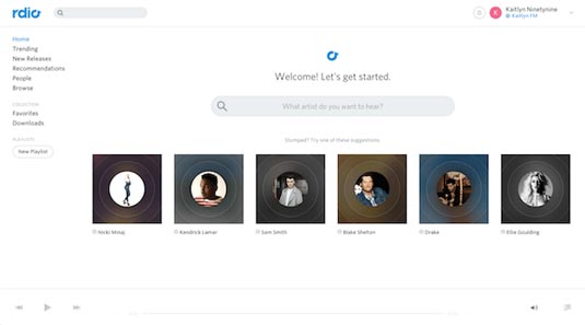
The two main sections are your personal music collection which is neatly split into playlists, downloads and favourites and a list of new music split into recommendations, trends, new releases etc.
One great extra feature is the radio station which is based on your own music library while the notifications are found at the top right of your screen.
03. Beats Music: the artist
Streaming service Beats Music was recently acquired by Apple for $3 billion which makes it a likely success in future.
Apple may have plans to integrate the service into iTunes which would be an exciting development. It has a 20 million song library and costs $9.99 a month or $99.99 a year.
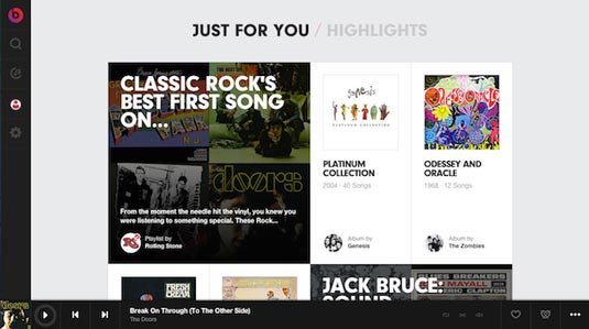
The service is laden with square interfaces in homage to the history of album covers but the whole design is extremely well done and looks arty rather than rigid.
When you press the 'Play' button the music player appears at the bottom of the screen and on the left of the screen you can search for music, browse through your personal collection or update your profile.
Unfortunately, library modification can only be done through the app which is frustrating; this means you can only play your library on your computer.
04. Soundcloud: the community player
Soundcloud is a service that has a more community feel and the UI includes a large amount of white space with bright colours to make page actions stand out.
It's a 'busy' interface which contains a media player that resembles an infographic, excellent social functionality which enables you to share, like or comment and a cool option for artists to tag their songs.
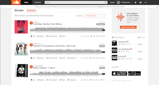
The toolbar at the top remains in place as you scroll and lets you change your collection or personal information while also searching and uploading music.
Finally, you can get feedback on your music by using the Call to Action on the right hand side of the page and a list of artists to follow.
05. iTunes: the media giant
While iTunes radio is free, you will have to pay from $0.69 to $1.29 per song on the iTunes Store. It is one of the least popular services by all accounts which may explain why Apple purchased Beat Sounds.
While the other services on the list typically allow you to download songs so you can listen offline and create playlists, iTunes only suggests the songs you should buy.
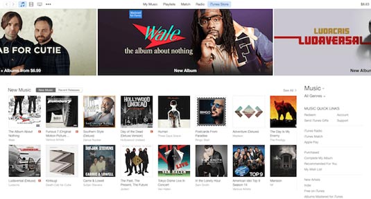
The backdrop is mainly white but there is an emphasis on bright imagery which highlights a music list (not your personal collection) while you can see a grid of new music on sale beneath the ad banners.
On the right hand side of the screen is outdated navigation which allows you to search for recommendations, radio etc.
06. Tidal: the new kid on the block
This streaming service is the new kid on the block and is owned by Jay-Z. The idea behind Tidal is to make artists the owners which ensures that they are well compensated for the music they create. Standard subscriptions begin at $15 a month while the high-res collection costs $24 a month.
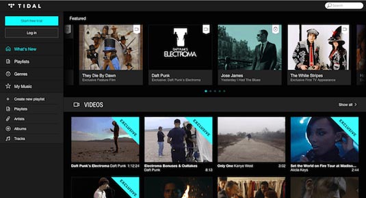
Tidal has been accused of ripping off Spotify and a quick look at the UI explains why. The colour scheme is very similar with the dark grey background with bright notifications and white text.
The featured artists section is made up of aesthetically pleasing rectangular shapes and the text beneath the imagery includes the artist title; scroll over it and you get 'play' and 'watch' options with more information placed on top of the image. It's fair to say that Tidal's UI is a simpler version of Spotify's.
Thanks to creativebloq