How to create the perfect design resumé
Follow these 16 pro tips to help your resumé stand out from the crowd and snag that all-important interview.
Follow these 16 pro tips to help your resumé stand out from the crowd and snag that all-important interview.
With designers fighting it out for every job that comes along, it's important that you stand out from the crowd. Whether you're just starting out or an old hand applying for a better position, your CV needs to be first rate for you to stand a chance of getting an interview.
Getting it right is about how it's designed as well as about what you write. Here we'll cover you both, as we walk you through the process of creating a designer resumé. You'll be landing that dream design job in no time!
01. Don’t use a word processor

Word doesn't offer the creative possibilities you need for a design resumé
Microsoft Word might be OK if you’re applying for a secretarial position, but if you’re after a design job or something creative, its limited and idiosyncratic layout options won't cut it. Art directors will be paying close attention to the layout of your resumé as much as the content, so use InDesign or even Illustrator to design something special.
Whatever program you use to design your resumé in, PDF is the best format to supply it in. This enables you to create good-looking documents that are completely cross-platform.
02. Choose your resumé fonts wisely

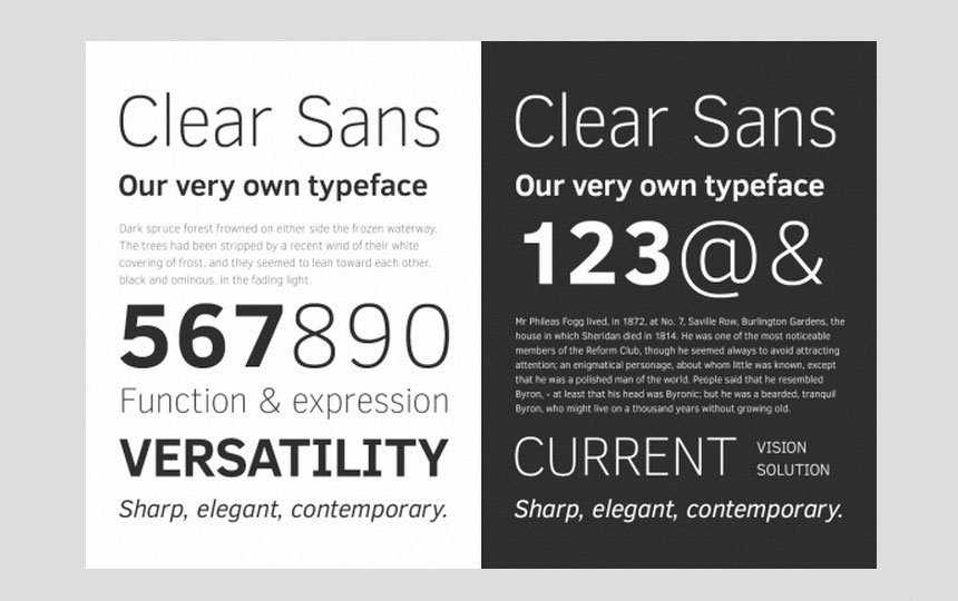
The aim of any designer resumé should be legibility
You’re a designer, so your resumé should follow the latest trends in typography, right? Wrong! The aim of any resumé should be legibility, so it’s generally a wise idea to stick to simple, readable fonts.
03. Consider using colour
For most non-design-related jobs, a resumé designed or printed in color is probably a waste of time. However, for design positions, touches of color are an acceptable way to add a discreet personal touch. Use color carefully, however, as green type on a yellow page may not go down too well.
04. Be brief

Don't write pages and pages of detail
Art directors do not have the time or the inclination to read your entire life story. Your resumé should ideally fit onto one side of A4, and if it's any longer than two pages, you’re waffling and including too much stuff.
Don’t be tempted to mask a lack of experience with verbosity. Clean, well-laid-out resumés will always win over flabby ones – remember, the aim is to intrigue. Point the recipient in the direction of an online portfolio to see more.
05. Include the right information
As a minimum, your resumé should include your name and contact details, including your email address, phone number and online portfolio URL.
This should be followed by a breakdown of your work experience, then your education. In both cases, this should be most recent first. Work experience should include dates, job title and a brief synopsis of your role. References are generally optional.
06. Don't lie on your resumé
We once received a resumé from an unnamed individual who claimed to have created quite a stunning website. We would have been extremely impressed were it not for the fact that we had actually designed the site.
Needless to say, that resumé went straight in the bin and the sender was rewarded with a strongly worded email. Honesty is always the best policy, as you stand a good chance of being found out if you start 'elaborating' in your resumé.
07. Include samples of work
By not including any samples of your work with your resumé, you’re pretty much guaranteeing that the recipient will not consider you for the post. If you work with motion, stills are perfect, unless you’ve been specifically asked to include a showreel. On the other hand, don't go overboard with images – that's a job for your online portfolio, which you can provide a link to.
08. Keep it simple
Unless you’re really confident and sure about what you’re doing, keep the typographic flourishes and fanciful designs at bay, ensure the layout is simple and clear and the information is cleanly presented. After all, the last thing you want is the recipient squinting because you thought dark grey text on a black background was a great idea.
09. Show your personality

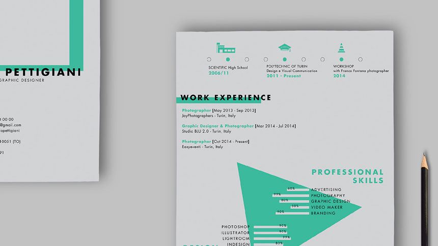
This bright CV by Paolo Pettigiani makes a statement (click to download the template)
Simple does not have to mean dull. A resumé is a reflection of your disposition and persona, and the recipient will be scanning it, consciously or not, for elements that distinguish your resumé from the other hundreds they have to wade through. Make your resumé stand out with an idiosyncratic design and personal touches... just don't overdo it.
10. Beware the novelty approach to resumés
We’ve had resumés written on scrunched up paper; arriving in the form of a jigsaw; and playing cards. We’ve had giant resumé posters, inflatable resumés and resumés crafted using delicate and complex paper engineering.
11. Don't plagiarise

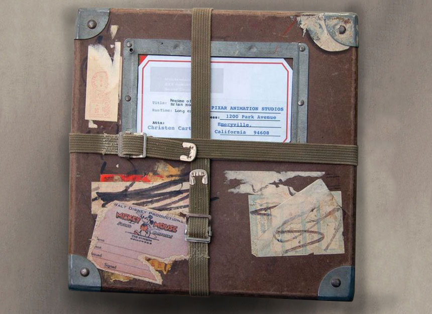
We've all seen this clever resumé concept... so don't try to pass it off as your idea
A surprising number of graduates see an inspiring resumé design concept and copy it. What can they be thinking? We all have access to the same internet, and if a particularly inventive resumé design has caught your eye, there's a strong chance it's been shared virally within the industry and will have caught the eye of your potential employer, too. Your resumé should showcase your creativity, not someone else's.
12. Don’t send photocopies
Don't photocopy; send a fresh resumé every timePhotocopies are cheap, but sadly they also look cheap, especially second and third generation copies. Type starts to break up, images are contrasty and full of noise, fingerprints and other blemishes begin to show up, and the results can look slightly askew. Fresh laser prints or sharp inkjet prints on the best quality paper available are the minimum standard.
13. Demonstrate consistency
Real-world design projects are usually centered around a single, consistent theme or concept that runs throughout the logo, branding, literature and so on. Your résumé, portfolio and covering letter need to demonstrate the same consistency. For example, are bulleted lists presented in the same style across each of your pages? Is the color scheme consistent?
14. Spend time on the covering letter
Most of the time, when you apply for a job, your resumé will need to be accompanied by a covering letter. This should look formal and business-like: this isn't the place to showcase your creativity and imagination. The text should complement the CV and it's best to keep it short and to the point (three paragraphs is a good rule of thumb).
Make it obvious you haven't just copied and pasted the same letter you've used to apply for a hundred other jobs. Write it in a way that's personal to the particular job and company you're applying for.
15. Create multiple resumés
If you're applying for multiple jobs, you should create multiple resumés, each targeting a specific role and the kind of experience and skills the prospective employers are looking for. To take an obvious example, if the job specifically mentions InDesign as a requirement then you should make this first on your list of skills, and possibly expand the description of how and where you've used it.
16. Check your spelling!
If you're applying for a job as a designer, does it matter how well you write? The simple answer is yes. Spelling and grammar mistakes will make you appear uneducated, ignorant and/or lazy – and none of these represent the image you're trying to convey. So, always double-check your grammar and spelling, and get others to check it too (it's easy to miss your own mistakes).
Thanks to Creative Bloq