Digital features that assist our online behavior
Over time, digital devices have moved from the sidelines to take center stage in our lives
A lot of us are familiar with the steadily rising tide of digital adoption, as some of us have even grown up in the midst of it. However, what’s less perceptible, is what it’s leaving in its wake.
Over time, digital devices have moved from the sidelines to take center stage in our lives — in part due to the natural course of innovation and also due to recent global events that compel us to make all our interactions digital. This has major consequences that are not sufficiently understood, in a world where the word “digital” is often associated with a solution rather than a problem.
However, while the idea of digitization began with the intention to save time and make life easier, there is growing evidence of adverse effects and consequences of digital device use that make them distracting, counterproductive, and even detrimental to our health. Some of these are unintended effects, while others result from some very deliberate design and engineering efforts that are intended to induce dependence, and sometimes, even addiction.
1. Push Notifications
Push notifications are those alerts from apps on our devices that draw our attention with a cue. These could be emails, WhatsApp texts, follow requests on Instagram, birthday reminders on Facebook, new discount deals on e-commerce apps, and so on. Depending on what your settings are, your phone might vibrate, emit a tone, or simply light up, indicating that there is an update that may require your attention. For many of us, notifications are such an integral part of life, that it is probably difficult to imagine it without them.

Push notifications were among the most groundbreaking innovations for businesses in the 21st century. What’s powerful about push notifications is that they can remotely draw a user’s attention to a brand or business even while their attention is turned elsewhere.
Those pings, tones, rings, and buzzes have a way of drawing our attention, and over time, we unknowingly form compulsive behavioral patterns that cause us to open our phones every time we hear a tone.
The mere sound of a notification is enough to distract our attention. Even when we choose to ignore them, they can continue to have a magnetic pull on our attention, which is often only quelled by going over to our phones and checking them.
2. The Recommendation Rabbit Hole
In the 1960s, Lays’ potato chips introduced the teasing tagline “Betcha can’t eat just one!” The slogan gained widespread popularity around the world, becoming an iconic brand tagline.
Fast-forwarding to 50 years later, the popular slogan is as apt as ever for something that was not even invented back in the 60s — the recommendation system. These intelligent, underlying algorithms in apps and websites seek to predict user preferences and recommend content accordingly.
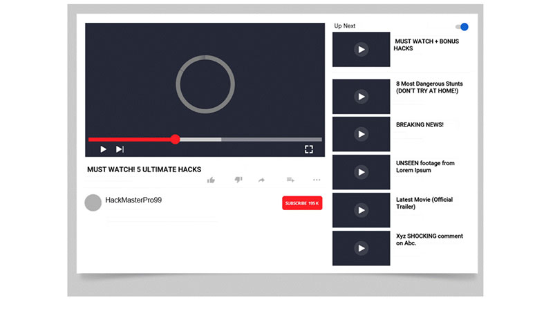
On the homepage of YouTube, the first thing you’ll see is a grid consisting of seemingly random video thumbnails under the title “Recommended.” Though the layout of this grid is identical for everyone, the thumbnails of the videos that appear in it are unique to every user. They’re all determined by powerful algorithms that present recommended videos to you based on a number of metrics including the type of videos you watched in the past, the channels you subscribed to, your location, and even your search activity on Google (YouTube is a subsidiary of Google).

Let’s say one of those videos piques your interest. You make one innocuous click. You’re taken to the video page, and if you’ve paid close enough attention, you may have spotted something. As the video starts up, a whole list of video thumbnails load on the right side, a fraction of a second before the current video starts. And voila, YouTube’s already curated a whole bunch of related videos that you “may” be interested in.
On the right-hand side, you’ll notice a video thumbnail placed slightly above the rest of the thumbnails and separated from them by a fine line. YouTube tells you that this video is “Up Next,” meaning that it will automatically play right after your current video ends. In essence, when you click on any one video to watch it, you’re actually signing up to watch a whole series of videos that have been queued up for you. At any point in time, if you find a video uninteresting, a whole bunch of other videos are readily available in the vicinity to move on to.
Before you know it, hours can go by, after you’ve gone down what’s colloquially dubbed as the “YouTube rabbit hole.” In 2018, YouTube’s Chief Product Officer revealed in an interview that over 70% of the videos streamed on YouTube are videos that users find in the recommendation list. That’s right, for over 70% of the time that is spent on YouTube, its recommendation systems are ushering users around, showing them more content like persuasive salespersons in a store.
Recommendation systems are more powerful than you think in guiding behavior, and over time, they can lead you to spend unintended amounts of time on websites or apps.
3. Attention-Grabbing Ads
A vast majority of the content on new media platforms is free for our perusal, and ads are the little caveats that serve as brief interruptions in an otherwise seamless experience. More often than not, these are negligible costs on our time, but on occasion, our curiosity does get the better of us, and we take the bait. And that’s exactly what platforms like Google and Facebook are waiting for us to do.
One-click is usually all it takes for the complex advertising machinery to make quick deductions about our interests and probe further by displaying similar ads. Ad services are continuously tuning and sharpening their knowledge of us because their goal is simple — get us to click on as many ads as possible, as more clicks translate to higher revenue.

In 2019, Google’s revenue from advertising was a staggering $134 billion, while Facebook’s ad earnings were estimated to be at around $70 billion. These figures grow every year, as the 2 advertising giants are always finding new avenues to advertise and maximize revenues from advertising.
However, Google and Facebook aren’t the only ones trying to maximize ad clicks — advertisers themselves take even more deliberate actions to design their ads in a way that would lure users. Oftentimes, advertisers have only a couple of seconds to make an impression, so what was initially the 20–30-second elevator pitch is now a 5-second pitch, before users can choose to “Skip the Ad” on platforms like YouTube. With technologies like Google’s AdSense, advertisers also have the avenue to follow relevant audiences as they visit different websites, making multiple impressions across websites, and increasing the probability that users take notice of the ads and open them.
Ads may seem like minor irritants that can be maneuvered around, but a combination of precise ad targeting and cleverly designed hooks in ad content can make ads additional impediments in our digital experiences.
4. The Scope of Search
The internet is like a sky-high tower or mountain, and almost anything under the sun is visible from it. Any passing thought, idea, or question in our minds can be easily indulged with a couple of clicks and keystrokes, and lo and behold, the internet presents all the information we need at a lightning speed, and then some. This can be an alluring power to have at our fingertips, and can also be the source of great distraction.

While trawling the internet may satisfy momentary curiosities, in the long-run, the habit of going down internet “rabbit-holes” may prove to be detrimental to learning and performance by dividing and distracting our attention from the tasks we initially set out to do.
Of course, the design of modern search interfaces also plays a role in turning us into internet wanderers. The ease of opening multiple new tabs, moving from one page to another, and watching embedded videos without having to exit pages makes for a frictionless experience. What begins as an innocuous pang of curiosity can lead to an hour-long deep dive into a completely unrelated subject.
The power of search may be a luxury of the modern-day internet, but as it applies to most other luxuries, the ability to limit its use can prove to be very difficult.
On a Final Note…
It’s hard to completely avoid digital interfaces today. In the past 2 decades, steady iterative design and redesign of digital interfaces has led to minimized friction and increased ease of use and personalization.
Besides seeking to tap into visceral needs for social approval and quick gratification, the apps we use are also designed to minimize friction, creating a smooth and slippery slope to slide down. In the sea of content and information all around us today, making simple, deliberate paths online can be increasingly challenging. With the prevalence of user-generated content and a steadily growing user base, there is an ocean of content to navigate through. Ironically, this abundance of choice can lead us to struggle to choose or be deliberate in our actions.
In these moments of indecision, we may end up turning to the paths of least resistance — the recommended paths — which involve opening notifications, scrolling down feeds, and clicking on recommended content.
Now more than ever, there is a need for opportunities that allow us to become more aware of our digital consumption, determine what is useful and what isn’t, and most importantly, reclaim control over our ability to choose in our online experiences.
Thanks to UX Planet