Why Flat Design will continue to rule the world in 2014
Flat Design is a minimalist aesthetic principle or design language currently used in various graphical user interfaces. At present...
Flat Design is a minimalist aesthetic principle or design language currently used in various graphical user interfaces. At present the two most commonly known implementations of flat design are the Metro (design language) used in Windows 8 and the new design that was introduced in Apple's mobile operating system iOS7.
1. Simple user interface (UI)
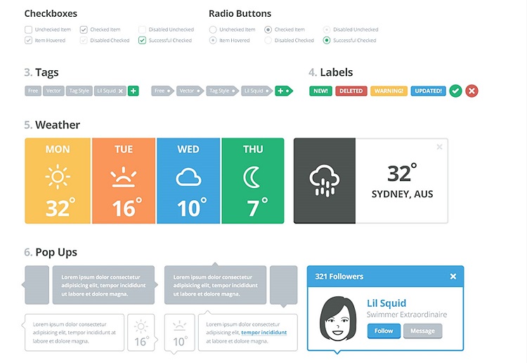
Simplicity does not mean lack of functionality, it means a fast initial learning curve and consideration for the number of concepts the user needs to understand. The goal for your designs should be easy to learn, but have a built-in path to higher proficiency. It's often hard to achieve this kind of scaling for a design, but the closer you get the happier your users will be.
2. Cross browser compatibility

In some cases older browsers might not support stuff like CSS gradients or box-shadows. Since such things seem to appear rarely in minimal designs, it is unlikely to make fixes, so as to support back compatibility issues.
3. Perfect for mobile apps
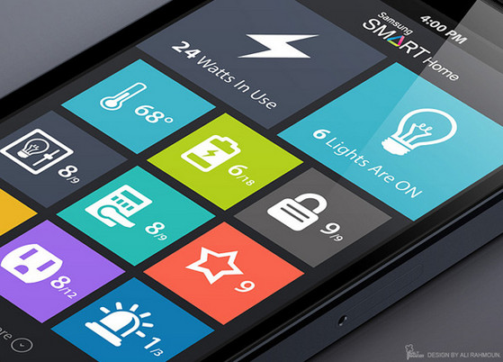
Mobile devices have small screens and they cannot handle too much of clutter. They can have the most striking flat interfaces/designs. There is no need to zoom to discover links as you have to just tap huge buttons. However, the flip side is that flat design may not be the best thing for complex web designs. So big buttons, simple background suits the best.
4. Responsive design

One of the most appealing aspects of responsive web design is that a responsive website can provide a great user-experience across many devices and screen sizes. This is an important characteristic, since it is impossible to anticipate all the devices and screen sizes searchers will use to access your site. A site that works well regardless of these variables will provide a better and more consistent user-experience than a separate mobile site that is designed for a specific device and screen size.
5. No More Skeuomorphism

Flat design primarily stresses on simple 2D representation. This is in stark contrast to the erstwhile usage of skeuomorphism in web design, which chose to represent images in the form of a real-world object, and employed shadows, textures and bevels to imitate the contours of the real world.
6. Minimalism

Flat web design relies heavily on the concept of minimalism. Geometric shapes will lose their value if your page is cluttered. Thus, white space is extremely important, and it serves as a form of breathing space for your viewers’ eyes. Unrequired elements and extravagant design has no room here.
7. Better SEO

A site’s SEO ranking determines how high it appears in search engine results – which in turn increases the likelihood of new customers finding it. When a site uses fewer images and smaller images, it takes a lot shorter time to load – which means, in general, that a site designed with flat design will have a shorter loading time and a higher SEO ranking.
8. Discourages Boredom Decoration

There’s nothing worse than looking at a design and knowing the designer was bored with the project.
The tell-tale signs include too many shadows, odd animations or just a smattering of random effects that don’t seem to have a place.
Because of the simple nature of flat design, constraints help keep designers “honest” if they want to complete a project in the true nature of the style.
Thanks to Shutterstock.