How to design UX for millennials
It’s no surprise that some in the design community are also turning their attention to specifically figuring out how to design for millennials.
Ah, millennials. They’re coming of age and are estimated to have annual purchasing power of more than $200 billion by 2017. That’s very significant, especially when you factor in e-commerce purchases right from the Web.
So it’s no surprise that some in the design community are also turning their attention to specifically figuring out how to design for millennials. Millennials have been raised on, and with tech, giving them a unique status compared to older generations like the Gen Xers and the Baby Boomers. Accordingly, design considerations should be unique to this generation, simply because they, like other generations, do things their own way.
Designers would do well for their clients and careers to focus on giving this demographic what they want and expect as they’re browsing a site.
Here are some vital factors to keep in mind when designing for millennial users.
RULE #1: MAKE IT MOBILE
Designers who want to please and attract the millennial users have to design with the mobile-first approach, as in making sure that their websites display properly and seamlessly on mobile devices. This is because stats show that more than 80% of millennials, those between the ages of 18 and 34, own a smartphone. Compare that to older demographics like 35- to 54-year-olds, where 68% own smartphones, and those 55 and up, where just 40% own a smartphone.
Since millennials spend a lot of time on mobile devices, it’s a best practice to put mobile design first to draw them in.
So what constitutes good mobile-design habits? These practices do:
- keep the core content of the desktop site and mobile site the same to avoid confusing users;
- optimize for mobile even if the core content stays the same, which includes making the user experience very tap- and swipe-friendly;
- define your grid and breakpoints appropriately for the mobile experience;
- ensure that mobile pages load quickly to keep users from leaving the site;
- limit the layers of navigation to keep users engaged with the site.
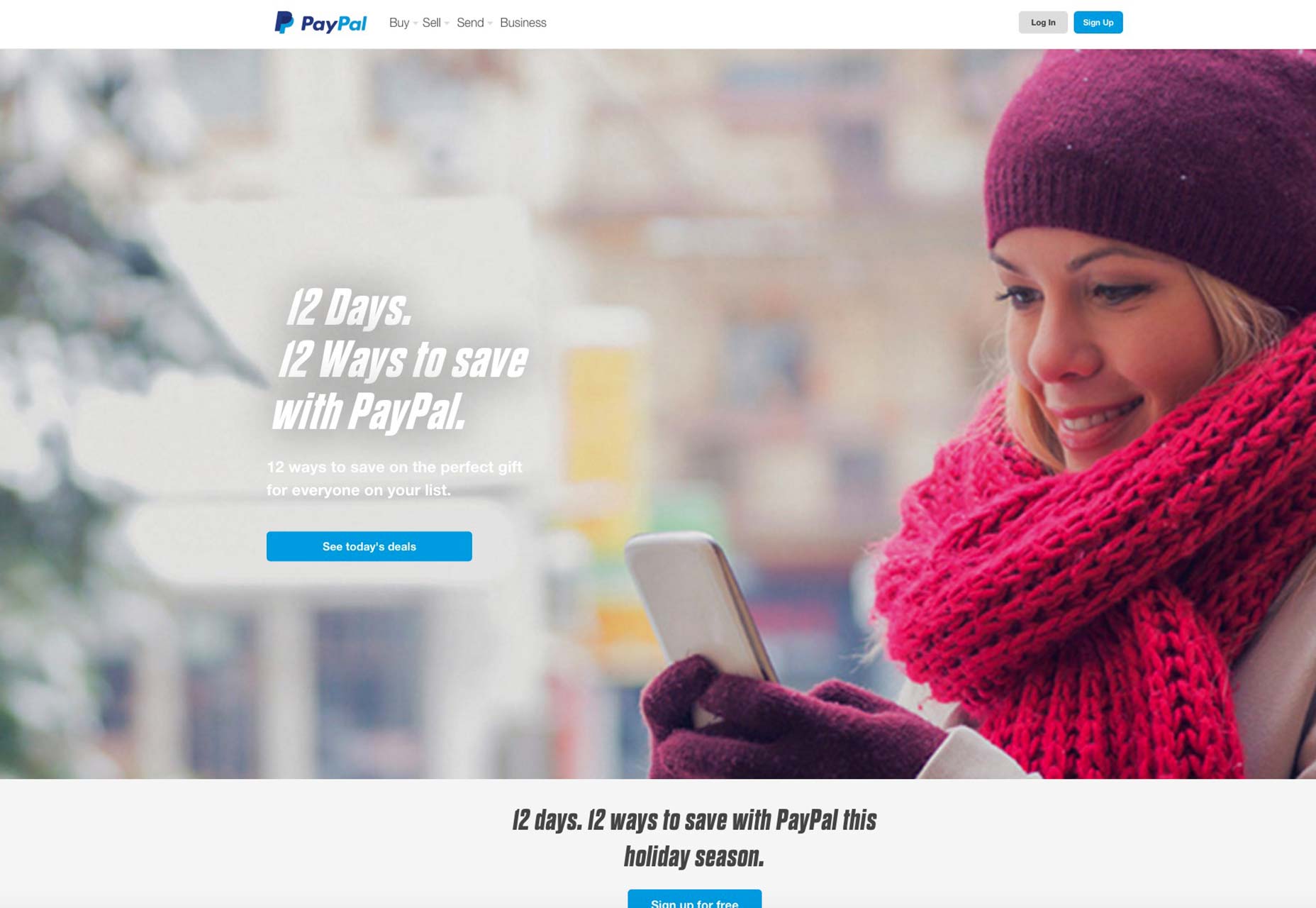
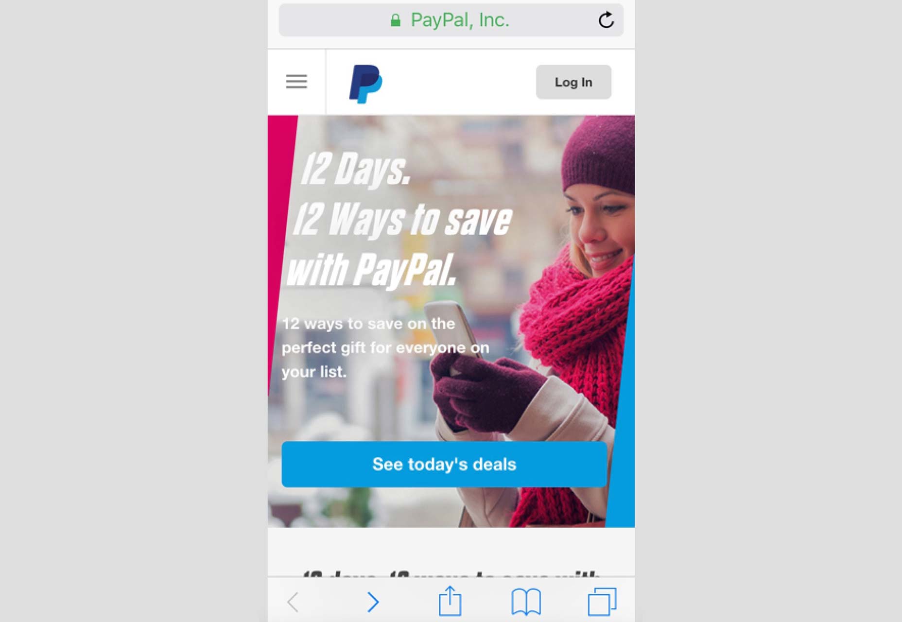
PayPal is a site that understands this well. When you compare its mobile site to the desktop version, you immediately notice that the core content is the same, the mobile site loads fast, and there are just two layers of navigation on the mobile site.


RULE #2: EMPHASIZE THE USER EXPERIENCE
It follows naturally that the user experience of your mobile site has to be top-notch if it’s going attract and then retain millennials. After all, with so many other sites out there, millennials—who are not the most patient bunch—will just go to another site if the site you built is slow, has glitches, or just makes it really hard for them to navigate.
Since millennials spend so much time on their mobile phones, you’ve got to give them a second-to-none user experience. Failure to do so means that conversions and dollars will go from your client’s pocket to another site’s owner whose designer has built a site with better UX.
The first thing that millennial users care deeply about is finding what they want quickly and easily, so simplify your site navigation! This means cutting unnecessary navigation elements from the desktop version and using a hamburger menu to save space.
Beyond this, it also means designing for unavoidable interruptions, whether due to real life or from other prompts on the millennial’s smartphone. Millennials can look at mobile sites or apps while standing in line to a concert, or be distracted by something else while on your mobile site, like when their phone rings.
To ensure that they can jump back to your site and efficiently use it, keep design minimalist and basic, giving them just what they need to accomplish tasks, whether that’s buying something or browsing news stories. By doing this, you also reduce their cognitive load, making it likelier that they’ll be able to finish what they were doing and complete a mobile page goal.

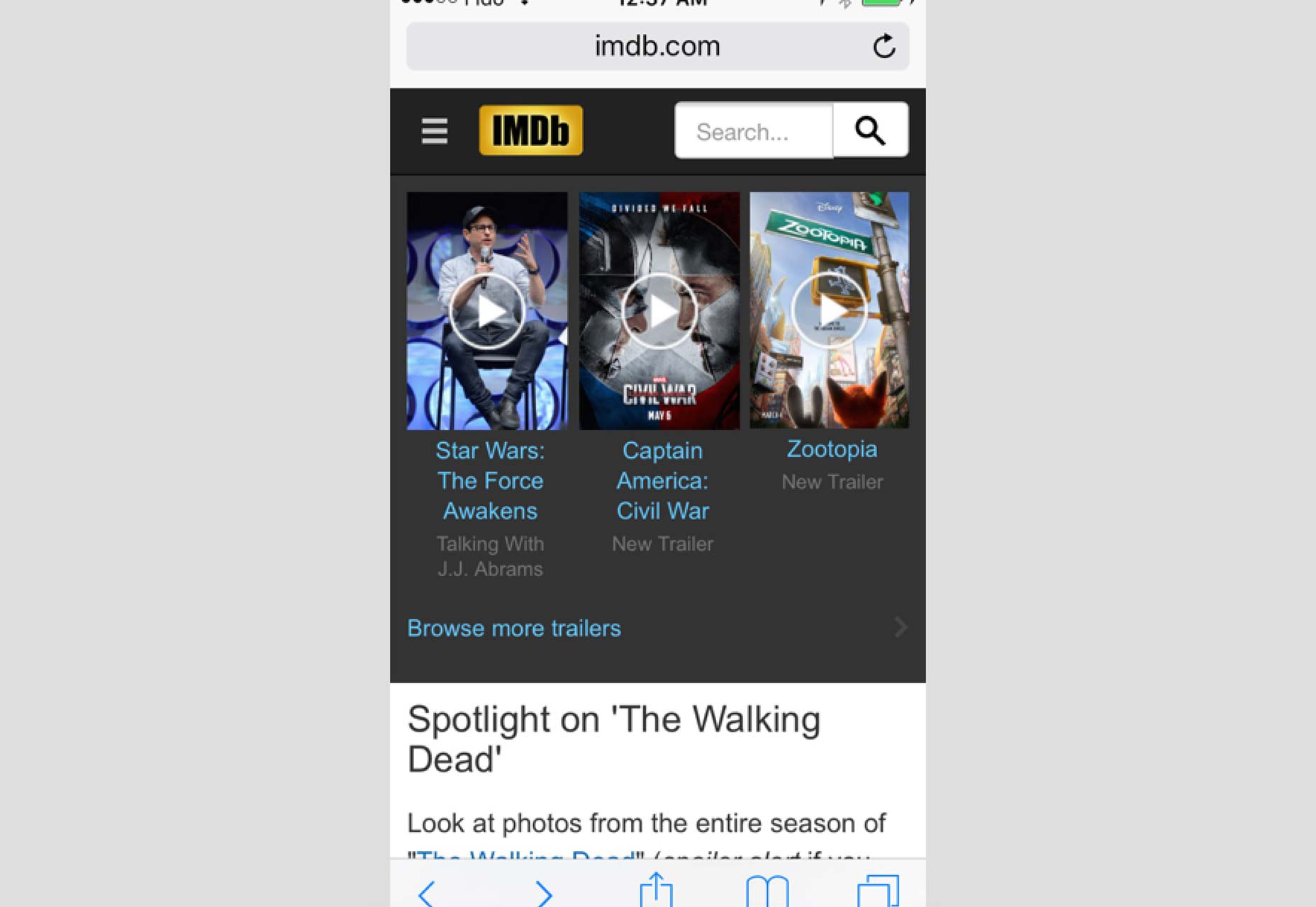
IMDB’s mobile site exemplifies this UX focus. Navigating the site on your mobile phone is very intuitive, with links to movies, actors and TVs easy to find, click on and return to after any distraction takes you away from the site. Its page layouts are also highly usable, making it likely that millennials will be able to find what they’re looking for with no hassle, wherever they are.
RULE #3: ENABLE SELF-SERVICE SOLUTIONS ON YOUR SITE
Millennials are into instant gratification because they were raised with tech, so much so that they expect customer service to be as easy as sending a tweet or clicking a call to action button. Surveys show that, in keeping with this being-in-control theme, millennials want customer service solutions to increasingly be self-service approaches.
This means no calling a number to wade through a long phone menu to eventually talk to a live person, nor does it mean live chat or sending customer service an email! It means empowering millennials to solve customer service issues on their own directly on a site, cutting out the hassle of dealing with another person.
So how can you design this self-service aspect into your clients’ sites?
Include copious resources like highly active and regularly monitored community and discussion forums as well as a page exclusively dedicated to FAQs, self-help tutorials and troubleshooting tips. Your millennial users will definitely appreciate being able to solve issues on their own much faster than having to wait around for a customer service rep to help them out.

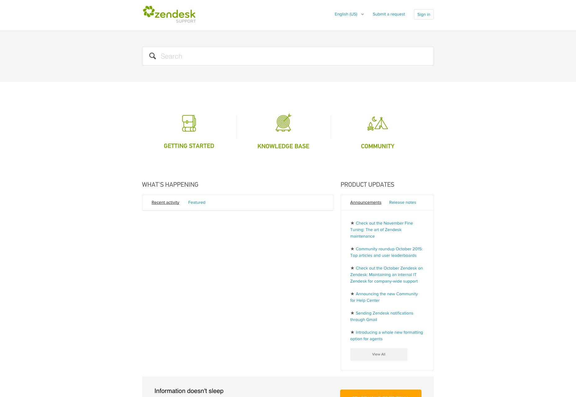
A great example of a site that does this excellently is Zendesk. Its support page is crammed with self-service options, everything from a community forum that encourages users to ask questions, to a thorough knowledge base where the basics of using Zendesk are posted in an easy-to-read format. Millennials surely appreciate such efficiency, control and resources that are always available at their fingertips whenever they need them.
MILLENNIALS APPRECIATE THESE DESIGN TOUCHES
You have to know how millennials behave on the Web to design for them effectively. This goes for your e-commerce efforts as well as just having millennials return to the same site and look at it as a trusted and enjoyable resource time and again.
It’s not difficult to understand the millennial user experience—all you have to do is look what device they use most, and it happens to be mobile. Armed with this knowledge, your design focus should be on mobile first for the millennial generation. At any rate, designing with mobile as a priority is a best practice of web design these days as more people in general shop, read, and do research on mobile!
So to snag your clients a piece of that whopping $200 billion pie of millennial spending power, it’s in your best interest as a designer to adopt these rules on your next design project.
Thanks to webdesignerdepot