The attributes of usability and how to exploit them
The importance of a strong online presence exponentially increases as time goes on. Companies need to follow their audience...
The importance of a strong online presence exponentially increases as time goes on. Companies need to follow their audience into the digital space and provide them with the optimal experience online.
However, just creating a website isn’t enough; there needs to be careful consideration into your target audience, their optimal experience and how you can affect it.
Using the 11 attributes of usability, one can determine how to present digital content that will best satisfy users.
1.Learnability

This attribute measures how easily and quickly a user can learn the functionality of a website. If a user can’t learn to use the navigation or how to interact with the features of the website, the learnability of the website is unsuccessful.
An example of failing at this attribute would be a user who is unable to locate a product category or how to find a specific section of the website within the structure of the design.
To successfully exploit this attribute, it’s important to keep your website as simple as possible. Too many call-outs, navigation options and images can distract a user from knowing what to do or where to go.
For some website models a degree of complexity is unavoidable. However, with a proper taxonomy it can still be turned into a simple structure.
On the Zara USA website, the navigation is easy to decipher and explore.
Zara can keep the visual look that it's going for by having all news and promotions as images in the background, with the more distracting content below the fold so as not to distract the user from learning how to browse the site.
2.Efficiency and effectiveness

The attributes of efficiency and effectiveness are almost one and the same. They both involve how well a user can interact with a website once it is learned.
Once a user has learned how to use a website, the efficiency of a website measures how fast they can accomplish their goal using the website.
Effectiveness is more related to how after one understands the navigation, organization and functionality; it should be easy for users to carry out their tasks.
There are many ways to exploit efficiency and effectiveness. Similarly to learnability, to succeed with these attributes the experience needs to remain as uncomplicated as possible; a user must be able to navigate from multiple parts of the website as possible.
Breadcrumb navigation, 'recently visited pages' functionality or comprehensive navigation options can help with this. SpyreStudios showcases various examples of efficient websites using breadcrumbs.
3.Memorability and retainability
 After a user learns the website and is able to use it with maximum productivity, the next attribute a website designer needs to consider is memorability and retainability. What these attributes measure is the ability of a user to come back to the website after an extended period of time and not need to relearn how to use it.
Aside from a simple web design, creating an easy-to-access FAQ or guide on how to use and navigate the website can help with these attributes. Alternatively, a 'tips' functionality that can be turned on or off will help navigate a new or returning user through the website process. Lastly, a well-structured site map is another way for a returning user to find the information they’re looking for.
4.Low error rate and error tolerance

To satisfy these attributes, a website needs to be as free of potential errors as possible; what this means is that there needs to be a minimal number of scenarios where a user must backtrack and start their process all over again. When errors are unavoidable, there needs to be a system in place that makes it easy to recover from.
There are various ways to succeed with these attributes. For one, the flow of the website needs to ensure that the possibility of error is as low as possible by providing clear instructions and direction for where a user needs to go next. If an error does occur, it needs to be easy to mend for the user; for example, if a form is filled out incorrectly there needs to be a system in place that notifies the user of the specific errors without starting them over in the process.
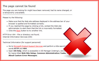
Also, proper web maintenance is necessary. For example, cleaning up as many 404 error pages (URLs on a website that don’t exist that a user lands on) as possible and 301 redirecting them to a live URL will keep users within the website experience. In case of a 404 error, a proper 404 page needs to be set up. In this example of a 404 error page on the Vectra 3D website, the user is kept within the navigation of the website and not taken out of the experience.
5.Attitude and satisfaction

It should go without saying, but the users’ overall feeling while using the website is an important attribute for an optimal user experience. The website needs to be satisfying and enjoyable to navigate and interact with. This attribute can actually be influenced by the other attributes, as well. If a website is difficult to use, has various errors or is constantly changing so users can’t remember its functionality, it will have low satisfaction.
Since this attribute is so subjective, it’s difficult to say one website is more satisfying than another. One could really enjoy the background music on the band Real Estate’s website; however, another could find it distracting. The only real way to ensure this attribute is satisfied is through user surveys and research.
It’s difficult to always have users take surveys, so offering some sort of incentive such as a discount on the next purchase or a chance to win a sweepstakes can help with survey engagement.
6.Usefulness, context/purpose, user characteristics

These three attributes are bundled together because they all are co-dependent on one another.
Usefulness measures how beneficial the content on the website is to the user.
Context and purpose measures if the content and website fulfills the purpose it is meant to provide to users.
The User Characteristics influences both of these factors because it takes into account how the target users’ take in information, what they want and other general demographics.
To succeed with these usability attributes, you need to understand your target audience and business goals.
What are they looking for?
How can your website provide that to them?
What is the purpose of your website, and what types of content can help achieve that?
Once these questions are answered, you can begin providing optimal content for your target users. A good example of delivering content that target users need and want can be found on the Havahart Help & Advice Library. It provides a host of information about all types of skin concerns to an audience that is perceptibly concerned with such issues. The content is written and provided by dermatologists so the users have more trust in its merit.
7.Interface/Design and Control/Flexibility

Quite possibly the most important attributes are the interface and design of the website as well as how much control the user has over them. All of the other attributes fall within what the design of the website really is.
You need to consider the affect colors have on users, what kind of font will appear to your users, what sort of navigation would make sense to your target users and many other design elements. Most importantly, what effect do you want your website to provide?
A good example of taking all of this into consideration can be found on the Clarity Way Alcohol Detox Rehabilitation site. It bases its design on the color of a neutral green, which according to various studies is believed to soothe illnesses and treat pain; users on this website are looking for comfort from their addictions, so this is very important.
Also, in regards to the control/flexibility attribute, there is the option to control font size because users on this website will likely want that sort of influence over the content they’re taking in.
8.Measuring the Effect

Once you have your website live, it’s important to continuously measure and test the effects your chosen design, content, etc. has on your users. It’s important to focus on engagement metrics such as:
Time on site, Bounce rate, Conversions (this will vary depending on what your website’s purpose is).
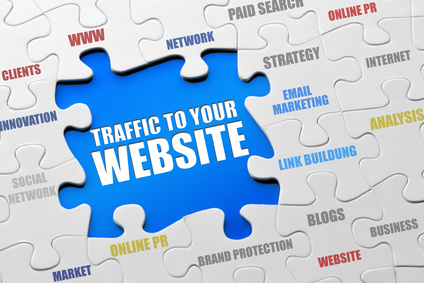
You can get heavy traffic to your site using other methods, but if the website isn’t providing a great experience, none of this traffic will convert to customers.Thanks to econsultancy.