How to know when your web design is done
It’s the question that haunted every first-year art student. It kept us up late adding, adding, adding layers of complexity to our pieces, sometimes to our detriment.
It’s the question that haunted every first-year art student. It kept us up late adding, adding, adding layers of complexity to our pieces, sometimes to our detriment.
You go through enough gut-wrenching public critiques of your pieces during that first year of art school that you quickly develop a better feel for when your work stops being productive.
You know when to step away from the canvas. You know when to stop tweaking.
And that, it turns out, was a vital skill to learn … both for my art and for my business.
Because when it comes to your website — that ever-morphing online representation of your business — knowing when to stop working on your design is not easy to figure out.
That’s what we’re going to cover here. You’ll discover how to know when to stop tweaking your website design so you can move on to bigger and better things in your business.
Don’t hide behind your “under construction” sign

Let’s just state the obvious: as long as your site isn't finished, you have a great excuse for not accomplishing anything with your business.
“I’m still working on my website” sounds like you've got an important project on your plate.
But as long as you focus exclusively on that, you can’t focus on other aspects of your business like your marketing strategy, your products and services, and your long-term vision.
Your goal should be to remove that “under construction” sign (whether it’s visible or simply psychological) as soon as possible, so you can turn your attention to the money-making aspects of your business.
Don’t tweak out of fear

Another common website-related excuse is that you “aren't quite done” with your site.
Websites, by nature, are a work in progress. But constant tweaking may be a symptom of unease with other aspects of your business.
It may feel more comfortable to tweak a web page than it is to make real progress with an element of your business that will add to your bottom line.
The best thing you can do is to tweak strategically. Make changes to your site when they’re part of an overall plan to improve processes or streamline your offerings.
The next time you find yourself endlessly changing HEX codes, or fiddling and re-fiddling with your typeface combinations, stop.
Take a moment to confirm that you’re not trying to avoid a larger issue.
Do you have the basics covered?

Before you walk away from your website design, make sure you've covered the basics.
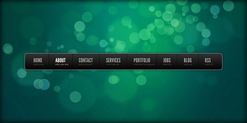
Every site should feature these pages, which visitors expect to find in your site navigation:
Home
Your home page makes an important first impression.
After hitting this page, your site visitors should understand what you offer, and who you serve.
You should establish your brand style on this page, and apply it consistently through the rest of the site.
About
Want to know a little secret about About pages? The most compelling ones talk about the people the business serves first.
Everyone wants to read about themselves, so start out by sharing who you serve and how.
Wrap up the page with information about why your business is trustworthy. Include photos of you and your team if you have one.
Consider adding testimonials (with photos) from satisfied customers.
Products or Services
This page may also be called “Store” or “Shop.”
This is the commerce section of your site, and should be a place where visitors can find out more about your offerings and discover products and services that suit their needs.
It should be clean, easy-to-navigate, and highly functional.
Contact
Your contact page gives visitors an easy-to-find way to get in touch.
Don’t share an email address on this page. Instead, use a simple form that sends you information once it’s submitted.
Blog
Here’s where you can wow your site visitors with your information, guidance, tips, and interaction.
Post at least once a week, and be sure to break up your posts with good formatting, include lots of images, and end with a call to action.
If you've covered these basics, there’s a good chance your site is ready to launch now.
You can always add pages later. Don’t delay putting it out there because you have additions planned for the future.
Don’t fear exposure

I've met a lot of people who have a tough time making their sites live. And I know that feeling.
In art school, I almost threw up the day I sat through my first public critique. Pinning my work to the wall, watching everyone look it over, and then listening to the good, bad, and indifferent comments was excruciating.
The first time.
The second time? Not so bad.
By the third time, I was an old pro.
Here’s how you can think about it so you skip that nausea-inducing first-time feeling:
- Your website isn't you. Separate your ego from your work. It’s a survival skill art students learn, and you can use it, too.
- Yes, your website is on display. But imagine that it’s in a gallery where you can go up to it, take it off the wall, work on it, and hang it back up.
- You won’t know what works and what doesn't until you put something out there. So … put something out there.
- There’s anonymity in numbers: With 2.4 billion published web pages as of this writing, chances are good that your site will spend at least a few months blissfully incognito. You can spend those months getting feedback from the visitors you have and making any necessary changes.
So commit to the site you have, make only the most-important changes, and plan for a revamp in the future if the site you publish doesn’t work for you.
Know when to stop

Your design is done when it’s communicating what your business represents and what makes it unique.
It’s done when you’ve covered the basics, and it’s clear and easy to use.
Don’t hide behind your website design project. Your site is a means to an end … and the end is more important than any single web page.
Thanks to copyblogger.