What makes a great search interface?
While having a great search box might not be the most fun part of the design process, it is often an essential part of your site
A search box is one of the essential pieces that is included in almost every website design. While sometimes the creation of this small element turns into an afterthought, there is no reason why the search box should not be designed as beautifully as the rest of a website.
The design of a search box should mirror that of the rest of the site, be functional and easy to use and be placed in a location that is obvious to users. Today, we are going to take a look at some great search boxes and a few tools to help you through your own design.
Does Your Site Need a Search Box?
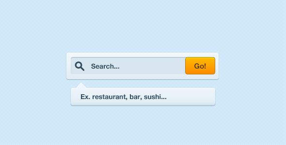
The simple answer is yes. If your site includes a significant amount of content – think more than a teaser or splash page – a search box is a must.
Having a search box makes it easier for users to find content. It can also help you gather information about what users want to find and are coming to your site for, such as product information, keyword usage and user wants and needs.
On the other hand, sites that work as a teaser or splash page might be fine without the inclusion of a search function. Generally, you might think that single-page websites fall into this category, but it really depends on the size, scope and design. Single-page websites featuring lots of content through the use of elements such as parallax scrolling could benefit from including search functionality.
Search Functionality
One of the biggest questions when it comes to search is “what should it do?” While this may seem like an obvious question and answer, how search functions can vary from site to site. Users can have different expectation for how search will work as well based on site content.
Simple search:
The most common type of website search is designed around a box that includes a place to type in what you are looking for and a “search” or “submit” button. Often the box will include what is searchable on the site, such as keywords or item numbers.
Intelligent search:
Google is the leader when it comes to intelligent search, which helps fill in what you are looking for based on popular search terms and relevance to the site.
Filtered search: 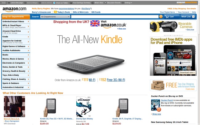
Sites using filtered search, give the user options for what or where to search for something within the site. Amazon is a prime example of using filtered search. In the top bar you can search the entire site for an item or narrow it down to a certain product category. (Amazon also uses intelligent search, showing that you are not limited to one type of search functionality.)
Search Box Placement

There’s a good reason why almost every site you visit has a search box at the top of the screen. That’s where users expect it to be.
An analysis by Site Search Today showed that of the top 50 United States retailers, all of them had a search box located at the top of the page. Of those 54 percent had a search box located at the top right, 30 percent in the top center and 16 percent at the top left of the page. The results were similar in a study of United Kingdom retailers with one major caveat – search is more commonly located at the top center of the site, followed by top right.
Placement you should avoid is anywhere below the scroll or at the bottom of the site. (That is, unless you include a search box in both locations.) Designers should also avoid hiding the search box within the navigation menu or inside of a toolbar.
Search Identifiers
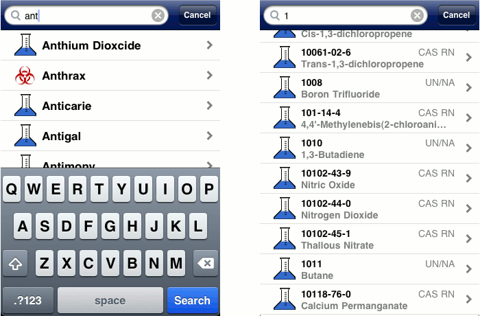
Search tools should be easy to both identify and use. If users can’t find the tool, it can cause frustration or make a user leave your site.
Common search identifiers are a box with the word search or a magnifying glass next to an input box. That’s it. When designing search, one of these options is your best bet.
And don’t forget the action button. Just like search identifiers, the button to execute the actual search should be simple as well. Use a word such as “search” or “find.” “Go” is another acceptable option.
Search Design Tips
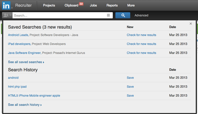
When it comes to creating a search box (or many other common user interface elements), simplicity is key. A search box needs several things: an input box, title, action button and instructions.
When designing a search box, the design should focus on a box. Sounds simple, right? Keep in mind that the box needs to be large enough to type (and see) common search terms relevant to your site and contain text that large enough to read in a simple typeface. Stay away from super small type or novelty or script typefaces.
Make it clear that you have search. Label your search functionality as such, either with a title next to or above the box or with text inside the box telling users to “search the site here.”
Make sure users know how to use the search. Include simple instructions within the search box that tell them what they can find using the tool. (But make sure the sample text goes away when the user clicks to type or activate the box.) Finally, include a clear call to action button for search submission.
Search Tools and Resources
Google Search Engine
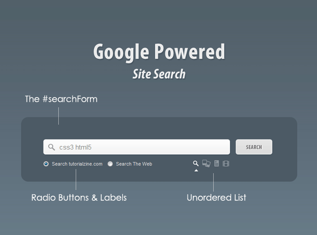
You can add Google search to your site with a simple tool that is free for basic features and can be customized to match your site design. Google also has a paid search tool that includes some extra goodies, including more design options, for $100 per year.
Search Input with Suggestion
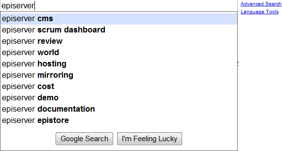
This simple box comes as an Adobe Photoshop file that you can customize somewhat to jumpstart your search box design. The layered vector file comes complete with an auto-suggest feature and is only $2 from Creative Market.
Search Bar Dropdown
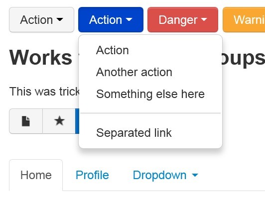
This simple search bar file uses a simple search format with a dropdown for menu options. The Photoshop file is free to download with proper credit.
CSS3 Form Pack
If you are not quite sure what style of search box you are looking for the CSS3 Form Pack includes six search form styles. The license for the whole pack is $4 for a nice collection of goodies.
How to Build a Search Form
By building from the code up, you can have a lot of control over your search box as well. SpeckyBoy Design has a great example of simple code for a clean search box that’s easy for almost anyone with basic coding knowledge to follow.
Conclusion
While having a great search box might not be the most fun part of the design process, it is often an essential part of your site. Think about the user first when creating a search box and then consider the overall design.
Search boxes can add great functionality to your site while looking great. Opt for a box that matches the overall theme of your website and blends in, but without hiding it altogether.
Thanks to designshack

