Busted myths about responsive web design
The need for addressing the importance of responsive web design has long since passed. Now it’s time to focus on how to make the most responsive design possible.
The need for addressing the importance of responsive web design has long since passed. Now it’s time to focus on how to make the most responsive design possible.
It’s what everyone is talking about, but unfortunately, not everyone knows what they’re talking about. All too often, you’ll come across some information on the Internet that challenges what you know about responsive design.
Sometimes the tidbit will be extremely constructive and will help turn your web design strategies in the right direction. Other times, you’ll end up confused, or wind up going in the totally opposite direction. When that happens, there’s no need to point any blame. The field of responsive design is still fairly new, and all of the kinks are still being worked out.
Besides that, creating rumors and myths is a part of human nature. However, as Barbara Streisand is famous for saying, “Myths are a waste of time. They prevent progression.” It’s far better to look for the truth than it is to get caught up in a myth. In order to do that, it’s important to recognize some of the biggest misconceptions that accompany responsive web design, and gain the tools necessary for a successful shift.
1. Responsive Design = Optimizing for Mobile

Yes, it’s true that recent mobile growth is the reason everyone is stressing responsive web design, and it does play a large role in the concept. But it’s not the only thing that matters. It’s also largely about considering the types of users and the devices they’re using. There are more devices besides mobile that need optimization, such as tablets and television screens. The real aim of responsive web design is to make a website fit any screen or monitor, at any ratio or scale, using any type of Internet connection. This goes far beyond the mobile screen.
2. Test on As Many Devices as Possible

In the design world, most designers don’t test their website on more than a handful of devices, and the same goes for responsive design. It would be impossible to test on all devices. There are hundreds of brands, and thousands of models, and by the time you finished testing even a large sampling, the tech would be out of date, and it would be time to begin again. A small sampling size is almost always adequate to determine the workability across all devices.
3. Typography Doesn’t Need Optimized
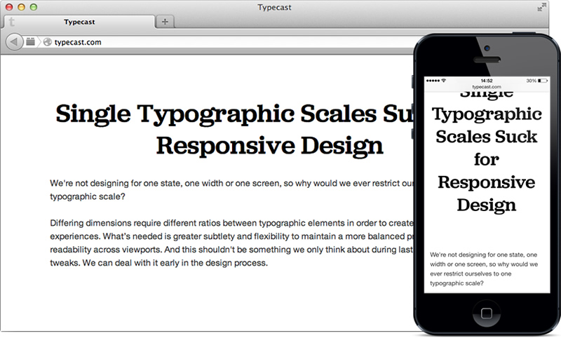
Unfortunately, too many designers believe this. They focus so much on the device and the size of the web page, that they fail to consider both the actual design and the user. In order to be successful, a website must be readable, and paying attention to the typography on responsive design is extremely important.
4. A Single Adaptive Experience Won’t Work

The assumption that people want different interfaces for different devices often trips up the savvy web designer. It leads designers to believe that they need multiple strategies and adaptations custom-made to each device. However, it’s not worth the headache. You can easily make a website that works across multiple devices with just one template.
5. Responsive Design and Heavy Page Loads Make for Slower Designs

It’s easy to blame the nature of the beast, but in this case, that’s just not fair. There are plenty of small-scale sites with heavy content that load quickly and without a hitch, indicating that it may not be the design that’s at fault for slow page loads, but the designer.
6. Responsive Design Won’t Work for Every Use Case

This is extremely misleading, since use cases are very important to a functioning responsive design. Designers must take into account each and every use case to identify, clarify, and organize system requirements across all devices. Your users aren’t going to want to pick and choose the situations in which they can access your website, so you’ll want it to be available at any time, and mastering the use case for a variety of devices is the best way to go.
7. Responsive Design Doesn’t Work for Retail

False. Though it may involve a trickier interface, responsive design works very well for retail businesses. In fact, it’s becoming a necessity. A study performed by Juniper Research shows that by 2018, 30 percent of all ecommerce transactions will take place over mobile devices. Furthermore, the amount of mobile shoppers increased from 393 million to 580 million from the beginning of 2014 to the end, indicating that it’s past time for retail responsive design.
8. It Takes Longer to Implement Responsive Design
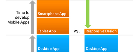
It may be true that it will take a little longer to get responsive design going, but not by much. In fact, it can actually save you time when it creates a common codebase and content base for a myriad of devices. Furthermore, more and more web hosting companies are adding responsive design coding onto their original package, which makes it easier and less time-consuming to develop both sites at the same time.
9. Everyone Is Turning Towards Responsive Design

Not everyone sees the value of responsive design. It can mean attracting the largest online audience, but that doesn’t necessarily mean that every company needs responsive design to be successful. It is worth it for every company to consider the cost to revenue ratio, though, even if the company decides they don’t need it.
10. Responsive Design Should Work on Every Browser

Developments in the responsive sector are improving all the time, but that doesn’t mean that you’ll be able to get any web design to work on every mobile browser. It will typically only work on browsers created since the inception of responsive web design, such as Chrome, Firefox, and Safari. You’ll have a hard time getting it to respond to older versions of Internet Explorer, which is just fine, since the user will soon discover they need to upgrade their browser anyways.
11. It’s Too Expensive to Implement

It’s true that it takes a different set of skills, tools, and technology to implement responsive design, but it isn’t much more expensive than other web designing endeavors. In fact, many hosting sites will offer a discounted rate if you already purchase web hosting with them.
12. Responsive Design and SEO Have Limited Connections
SEO is now strongly connected to responsive design, thanks to the Google algorithm update released earlier this year, websites will be penalized in their rankings if they are not optimized for mobile use. Google’s main goal is to give its users exactly what they want, and the major search engine won’t reward you with higher rankings if your site isn’t user friendly for their large mobile audience.
13. It’s Easy to Transition Existing Content to a Responsive Design
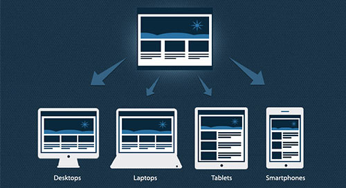
On the contrary. It takes some finagling to seamlessly transition content from the big screen to the small. The transition process involves recognizing the most important content, trimming out the excess, and shrinking it to fit smaller devices. Above all, it’s best to approach all new content with a “mobile first” perspective, which will make it much easier for you to use devices across both platforms.
14. “Mobile First” Means Focus More on the Mobile Design than the Original Website
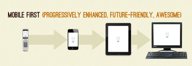
If you’re thinking mobile first, you’ll be thinking user first, which will translate to a better experience for the user, on the mobile site and the original site. The concept features a well-thought-out way to offer an all-around better experience for the user, no matter how they’re accessing the content.
15. Individual Device Breakpoints Should Be a First Priority in Responsive Design
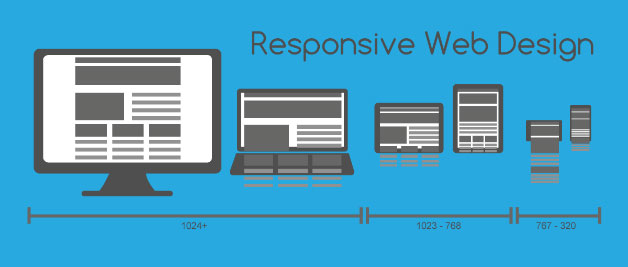
Responsive design isn’t about scaling down a website to fit a particular device. That’s just making more work for yourself than is necessary. If you want to develop a responsive website, you’ll need to design an interface that will work across a myriad of devices, not just one. It’s not only about the individual device breakpoints, but about building a framework that will work with any breakpoint.
16. Universally Optimized Images Will Work for All Screens

Since you’re trying to stuff an image into a smaller container size, you’ll obviously need some image optimization. However, a one-size-fits-all image won’t cut it, even if that image has already been optimized for a smaller device. Devices come in all different sizes, and if the universally optimized image is too big, the page won’t load. If it’s too small, the design will be skewed. In general, you can optimize images in a range of sizes to fit a range of devices.
17. Content Can Become Hidden in Responsive Design

Maybe this is true, but only if the web designers have no idea what they’re doing. For the seasoned web designer, this myth is absurd. The purpose of a responsive web design is to make content easily available and accessible. Hiding content is the antithesis of this idea, and it’s never something you’d want to do on purpose. If you focus on accessibility rather than hidden content, you shouldn’t have a problem building a responsive interface.
18. Responsive Web Design Is the Future

Perhaps this myth stems from the fact that only 22 percent of marketers say they have an expert handle on responsive design, 29 percent say they have an average understanding, 23 percent say they have a basic understanding but are behind, and four percent say that they’re hopeless when it comes to responsive design.
But the reality is that responsive web design is now. People want more responsive websites today, not in five years. The only way to get ahead of the responsive design curve is to implement best practices today and be looking towards even more seamless accessibility and integration in the future.
19. Responsive Web Design Should Be Your Only Priority
Again, this is wrong. Success in web design means being able to wear several different hats, and wear them well. You’ll need to learn to balance your upgrades to the original website, your blog, your mobile sites, and all other aspects of your web design responsibilities.
Furthermore, the real priority should always be the user experience. Oftentimes, making mobile a priority is the same thing as putting the user first, but not always. As a web designer, it’s your responsibility to find that balance.
20. Responsive Web Design Is a Perfect Model

Hopefully no one really believes this myth. The seasoned designer understands that there really is no such thing as a perfect model, particularly with such a quickly developing entity. There will always be quirks, slower loading times, and other issues for users to complain about.
However, it’s the best model we’ve got for improving the user experience across multiple devices, and it’s also your best bet for boosting user engagement with your brand. With more than 60 percent of all internet activity being accessed on a mobile device, it’s a very important model to consider, even if it is flawed.
Responsive web design is not an exact science, and it’s difficult to understand all of the ins and outs of what makes it successful. However, it’s worth investigating and mastering to improve your overall success with your company.
Thanks to instantshift