Top 10 brand campaigns of 2013
Creativity knows no limits. Watch some of the best campaigns released in 2013...
1. O2: Be More Dog
Mobile network providers are hugely competitive, and their customers can be notoriously fickle - lured by an appealing tariff, promise of a better service or a better deal on that shiny new handset. So their advertising needs to cut through the noise.
In the UK, Orange has traditionally led the way with witty, memorable ads, with Three dabbling in the more bizarre and surreal. The new EE network, meanwhile, is wringing plenty of use out of its contract with Kevin Bacon. The old guard of Vodafone and O2 have tended to bring up the rear in the creativity stakes.
Until, that is, O2's Be More Dog campaign hit our screens: the tale of the once-nonchalant, lethargic feline protagonist that sees the error of its ways and is reborn with the bounding exuberance of a dog is skilfully brought to life by CGI masters MPC. The 60-second TV spot is supplemented by a print campaign, a big social media drive, and an interactive game to boot.
2.Adobe: Creative Cloud
Designers the world over have been debating the pros and cons of Adobe's subscription-only creative software service for months now, but one thing's for certain: the ad campaign that heralded its official launch really laid down the gauntlet for rival software releases.
In line with the four core disciplines to which Creative Cloud caters - design, video, web and photography – Adobe brought on board world-class creatives Vasava, Dvein, qubibi and Erik Johansson to each put their own unique spin on the CC identity.
Barcelona-based Vasava, representing the design community, opted to transform the logo into a bird: "It goes wherever the wind blows," explains creative director Bruno Sellés, "and when its wings and tail touch the ground, a spark evolves and unfolds."
3. Nike: Reuse-a-Shoe
Nike's innovative Reuse-a-Shoe scheme has been running since 1990 and, as the name implies, is all about recycling old trainers - into a new material called Nike Grind. This is largely used in the production of courts, synthetic turf pitches, running tracks and many other sports surfaces.
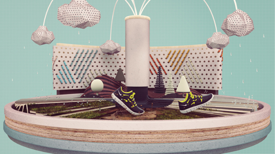
In 2013, leading motion studio ManvsMachine was brought on board to bring the program to life through an engaging animated spot to boost awareness of Reuse-a-Shoe, and the 450,000 locations around the world to have made use of the Nike Grind. It documents the life of a shoe, and particularly how it's given a second life - a truly compelling piece of creative work.
4. Beck's: Art in Progress
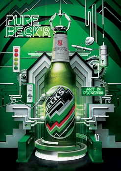
British born, New York-based design studio Vault49 has brought its inimitable style to this illustration-led campaign for Beck's beer. Reflecting a growing trend for production-line-style visuals that reflect the creation process - also noticeable in Nike's Reuse-a-Shoe campaign - the ad explores the different elements that go into a bottle of Beck's, from an imaginative, conceptual viewpoint rather than a literal representation of the production process.
Tubes weave around the bottle while hovering robot assistants wield an assortent of tools - a crisp, cool beer emerging through a white mist at the centre.
Over a few relaxing brews, our minds wandered into the wonderful world brewing the golden elixir," explains the studio. "After mopping up the drool, we proceeded to realize our own special line of art-inspired Beck's, and couldn't be happier with the results."
5. Pantone: Rain Edition
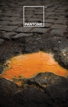
A collaborative effort between Italian creatives Giuliano Lo Re and Matteo Gallinelli, this inspiring campaign for Pantone puts color front and center, as you'd expect for the kings of the special ink. But rather than play the well-worn rainbow card, the duo opted to explore the relationship between color and water - particularly rainwater.
In a series of posters, vibrant splashes of ink lift unassuming puddles off the dull grey pavement, with the dyed water trickling between the cobblestones to create some quite beautiful shapes. As Lo Re and Gallinelli put it, the campaign is a heady blend of "the Pantone Universe, rain, dust and a pinch of creativity". In short, it adds a real sense of playfulness to the brand.
6. Marmite: Don't Forget It
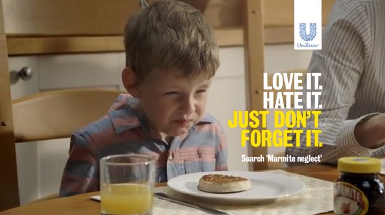
It takes a rare mixture of guts and wry self-awareness for a brand not just to concede that a sizeable proportion of people hate it with a passion, but to make it a central conceit as part of its promotional activity - and Marmite's 'Love-Hate' messaging is justly famous.
Adam&EveDDB has taken it a step further in this latest campaign, satirising animal cruelty appeals by "raising awareness" of woefully neglected Marmite jars across Britain.
It sparked a tirade of complaints from those who believe it trivialises animal charities, although a Marketing Week survey revealed that an overwhelming 85 percent of respondents gave it the thumbs up. Love it or hate it, the ad is definitely memorable and takes Marmite's well-established messaging to the next level.
7. Nespresso: One Second of Emotion
A joint production between ChezEddy and Soleil Noir Paris, this luxuriant commercial for Nestle's premium coffee sub-brand Nespresso is a real treat for the eyes - emphasising the smooth, sensual quality of the coffee above all else.
Directed by Maxime Bruneel, the film is shot at a very high frame-rate in order to capture the dripping, splashing liquid in gloriously graceful slow-motion as it creates abstract shapes and forms. Besides the evocative rich brown that you'd associate with the product itself, various other colours are also used within the ad to represent the diversity of Nespresso's full range.
8. Ikea: Make Small Spaces Big
Mother London has created its fair share of bizarre ad campaigns, notably a string of memorable spots for flat-pack giant Ikea, soundtracked with infectiously catchy tunes about playing with your friends, and hanging around in the kitchen at parties. Earlier this year, garden solutions were given the spotlight as the agency ramped up the surreal factor with a couple waging war against their banished gnomes.
Mother really hit the jackpot in the creepy stakes with its latest instalment, however - pushing storage solutions for small spaces through the medium of a human-sized Barbie doll protagonist and her equally plastic-faced children as they go about their daily lives in a space literally the size of a dolls house. It's made comfortably habitable thanks to Ikea's space-saving tricks, and Aretha Franklin's One Room Paradise provides the soundtrack. It's certainly memorable.
9. British Airways: Picture Your Holiday
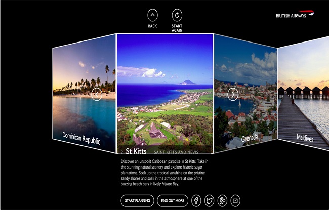
This inspiring digital-first campaign by BBH London set out to raise awareness of the fact that BA provides a full-package holiday service, as well as just the means to get you there. At its core is Picture Your Holiday, a deceptively simple tool that helps steer you towards your ideal destination by encouraging you to compile a selection of images that evoke the climate, mood and type of experience you're looking for.
Working across web, iPad, iPhone and more, the tool has a distinctive concertina interface to present your curated imagery - which features across all aspects of the campaign, from print posters to interactive screens in shopping centres.
10. Honda: Hands
With an unprecedented history of stunning, award-winning ad creative, the bar is set remarkably high for any new spot for Honda. Wieden+Kennedy London doesn't disappoint with this beautifully crafted online promo to announce its sponsorship of Channel 4's documentary strand.
This two-minute video was directed by Smith & Foulkes - the animation duo behind Honda's multi-award-winning Grr campaign. In the spot, a pair of hands interact with miniature versions of some of the Japanese motor company's greatest inventions, from a solar-powered concept car to its loveable stair-climbing robot, Asimo, closing with the immortal tagline, 'The Power of Dreams'.