Web Design Trends 2018: What Will Make an Impact This Year?
The subtle shift from UX design to digital service design is going to continue
Last year was very much about web animations and microinteractions, conversational interfaces and chatbots, design sprints and bespoke illustrations. Even an approach that rejected mainstream web design trends became a trend itself: brutalism.
All of these trends are going to grow in 2018. In fact, Andy Budd, co-founder of pioneering UX consultancy Clearleft, thinks the subtle shift from UX design to digital service design is going to continue, and that we’re going to see much more interest in the field of service design from the digital sector this year.
Other web design trends also originated many months ago, but are now maturing and entering the mainstream.
1. Variable fonts
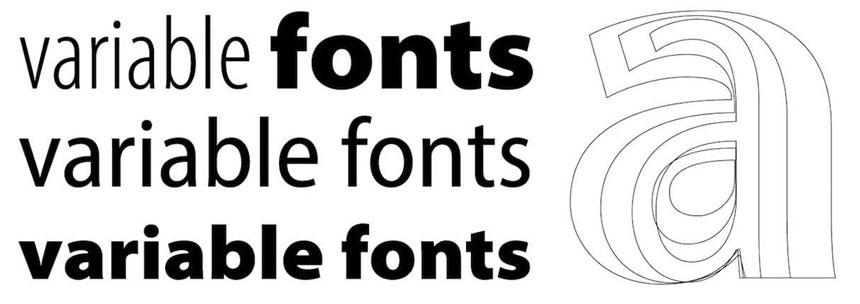
Jason Pamental, designer, strategist, and teacher, thinks that variable fonts are going to make a big debut in 2018.
“Support for them is growing rapidly at both the OS and browser level,” he explains. “The big providers are moving rapidly to expand the available typefaces. That sets the stage for a huge change in how we can design for the web: we can use any width or weight we want in our designs — vastly expanding our ‘vocal range’ in giving voice to our words — all while still improving overall performance with reduced file size.”
Jason also predicts that we’ll see an increase in how we can design for the user’s context.
“Variable fonts make it possible to tailor character width for different screen sizes and languages to provide better line length, adjusting text grade (think overall foreground/background contrast) for people with low vision or in low-light scenarios, as well as adjusting the ‘optical size’ of characters as they are represented at physically smaller sizes for better readability. And that’s just what we can see now. Once we have more time and real use cases, there’s no telling how much more we can do.”
Variable fonts are a new font format offering unprecedented flexibility.2. More creative layouts
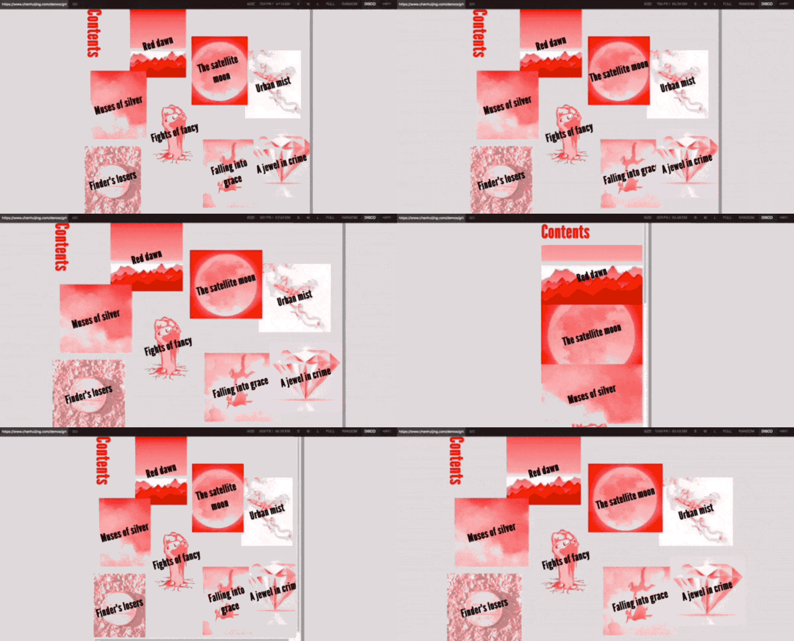
Self-taught designer and developer Chen Hui Jing from Singapore considers the official release of CSS Grid in 2017 a milestone in web design.
“For the first time, we have a level of control over how elements are rendered on a web page that we've never had before,” she explains.
“The web is a unique medium, and it‘s high time we established a new normal for it, breaking it free from the shackles of static print design. This new normal involves ceding control of our designs to the browsers that render them rather than constantly engage in this battle to dictate where every pixel should fall.”
The web is a unique medium, and it‘s high time we established a new normal for it, breaking it free from the shackles of static print design.
Chen Hui Jing
“The evolution and maturation of CSS over the past 20 years allows us to do that now, using properties like feature queries that let us present a different design depending on which features the user's browser supports.”
As more than 75 percent of people accessing the web use a browser that supports CSS Grid, and other layout-specific properties like Flexbox, writing-mode and CSS Shapes become more popular. Hui Jing hopes to see more creative layouts that utilize graphic design concepts, like overlap and vertical whitespace, yet still dynamically fallback to a feasible layout on older browsers.
Modern CSS lets us design our layouts to be most effective in the environment they have to perform in.3. The rise of WebVR
Brad Weaver, partner at design studio The Banner Years, thinks 2018 will still see baby steps in regards to AR and VR.
“We’re a few years away from our first watershed VR experience,” he believes. “Until then, expect websites to find new ways to incorporate at least novelty experiences. I’d look at the Super Bowl, Grammys, and other events that share a digital and real-world or television experience to lead the pack here for a while. Expect some creative websites from agencies that are bridging the gap between mobile gaming, web, apps, and experiences to bring fresh ideas to the table. I think we’re pretty close to website scavenger hunts in the wild.”
Ada Rose Cannon, developer advocate for Samsung, has seen more and more content producers moving to WebVR over the past year. The shift seems to take advantage of two features of WebVR:
- It reduces the number of hurdles for the user to use what you build. The user only has to worry about putting on their headset, rather than installing software.
- Once it has been made for one platform, it should work on new platforms out of the box, which is handy for the rapid progression of VR hardware.
“It's a tradeoff,” Ada admits. “It’s best for smaller experiences. If you need to download hundreds of megabytes of assets before you can render your first frame, then it will be difficult to build and there won't be much of an advantage to using WebVR. Sometimes this can be solved by rethinking the architecture or scaling back the experience in order to reach more people.”
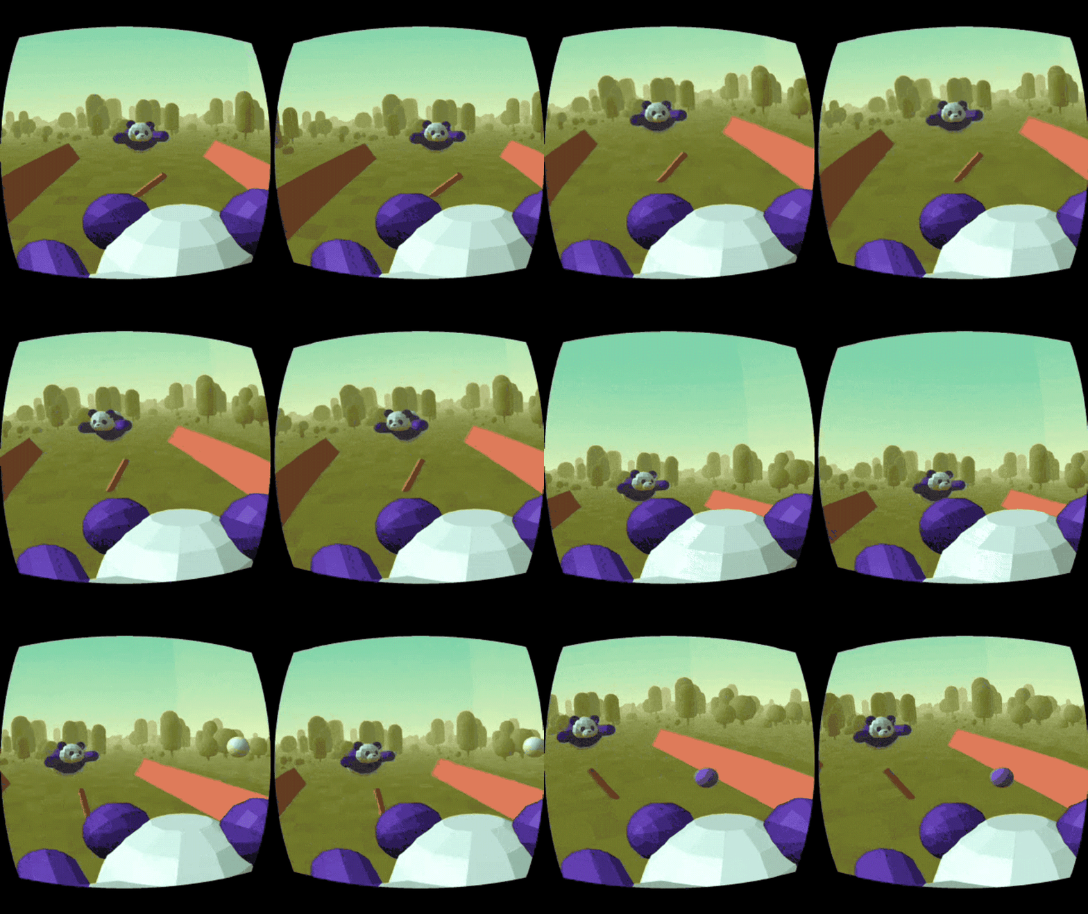
Hungry Pandas, a WebVR demo created by Samsung.4. Artificial Intelligence
Chatbots and voice user interfaces, also known as conversational UIs, were a big trend last year. While a lot of them aren’t driven by AI at the moment, Clearleft co-founder and CEO Andy Budd feels the promise of AI is definitely in the air.
“I think we’re going to see a lot more talks, articles, and case studies on the intersection between UX design and AI,” he predicts. “This intersection will be most notable in the field of robotics, the ultimate ‘headless UI’. In order to get ahead of this trend, I had the pleasure of taking 20 designers, technologists, authors, academics, and futurists on an AI retreat last September. You can see the results of that retreat in the form of a series of questions and design guidelines that we call the Juvet Agenda to help when designing robots and AI systems.”
5. Sustainable design

The internet uses about 10 percent of the world’s energy. Its environmental impact is already 50 percent larger than that of the airline industry — and growing at breakneck speed. It’s about time we do something about it.
Tim Frick, CEO of Chicago-based digital agency Mightybytes and author of Designing for Sustainability, explains.
“The environmental community has successfully taken the lead in pressuring large tech companies like Google, Apple, and Facebook to power their data centers with renewable energy. However, at nearly 3.4 MB, the average web page is almost 400 percent larger than it was just seven years ago. With billions of pages online, we have created a web full of slow, bloated, inaccessible experiences that frustrate users and contribute significantly to annual global carbon emissions.”
Tim says the design community is in a unique position to make major progress on this issue.
“It’s up to us to help our clients make more responsible choices. By getting users to the content they need quickly, providing efficient, inclusive experiences once they arrive, and hosting our digital products and services with renewable energy whenever possible, we can significantly reduce the environmental impact of our work while creating more people-friendly solutions in the process. Sustainable design principles can and should make a huge difference, not only at the microinteraction level but at the global level as well.”
6. Inclusive design
Related to sustainable design is inclusive design, which accessibility pioneer Léonie Watson thinks will become more pervasive in 2018.
“The days of making assumptions about how, where, and why people consume content in the ways they do, are over. The need for inclusion is now ubiquitous,” she says.
For Heydon Pickering, a freelance web accessibility consultant, interface designer, and author of Inclusive Design Patterns, who has been trying to help make inclusive web design a more mainstream practice and topic of discussion, it’s been a joy to see it emerge as a trend.
“Accessibility is a hard sell for some people, for reasons that remain spurious,” he points out. “But outspoken advocates have normalized it. I'm most pleased with the interest I now get in making inclusion a part of the design process, from the outset of a project. This is the most efficient and effective way to make accessible products."
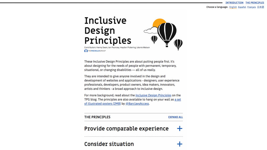
The Inclusive Design Principles are about designing for the needs of people with permanent, temporary, situational, or changing disabilities.
7. Ethical design
Sustainable and inclusive design are indicative of a wider movement in design: ethics are becoming more and more important.
Lara Hanlon, designer in residence at IBM Design, points out that apps are often designed to distract, interrupt, and encourage digital addiction, which can have dramatic consequences, including a steady increase of anxiety and depression among teenagers today.
“Small steps to consider the moral repercussions of one’s work might lead to more humane outcomes,” she suggests. “Investigating the potential psychological or environmental consequences might inspire better decision making.”
“Moving fast and breaking things might seem like fun for a while, but many working in digital are starting to notice that the things they're breaking are actually people,” he argues. “Now that we're living in the most euphemistically interesting times, they're looking for a way of using their skills for something meaningful.”
“All the evil powers that digital designers use can also be harnessed for good. That reciprocity-reward cycle that you use to keep users addicted to your app? You could be using that same technique to keep people engaged with feeding the hungry. That ‘most popular’ highlighting trick you do on the pricing page of your EvilSaaS? That could be the donation page of a charity trying to find the cure for cancer. If you work in digital, next year is going to be a good year to decide if you want to be Finn or that nameless stormtrooper who bangs his head on the door frame.”
8. Design systems
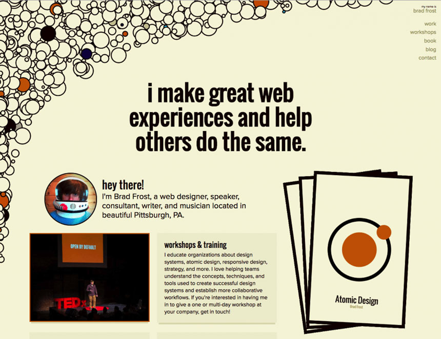
There’s a whole conference dedicated to design systems, as well as several books, including Design Systems by Alla Kholmatova, InVision’s free Design Systems Handbook, and Brad Frost’s Atomic Design.
Brad thinks that design systems will continue to be essential vehicles for creating great digital work.
“Digital teams are tasked with creating more products, services, and features that need to work on more devices and environments than ever before,” he explains. “To tackle this herculean task, they need solid ground to stand on. Design systems help collect institutional knowledge, so that different product teams and different disciplines can all speak the same language in order to produce higher-quality work faster than ever.”
Atomic Design details all that goes into creating and maintaining robust design systems.9. Voice user interfaces
Paul Woods, chief creative officer at global design firm Edenspiekermann, think that design is not all about screens anymore.
“As the screens we interact with become smaller and smaller — or in the case of Alexa and Siri, disappear altogether — designers will need to expand their toolbox to encompass a non-visual skillset,” he suggests. “Understanding how to build great voice-powered interfaces will become an ever-increasing requirement for the UX designer of tomorrow.”
Lee Mallon, managing director of Rarely Impossible, agrees.
“Voice experiences will consume a significant amount of your time, completing everyday duties in the coming years due to their time-saving benefit. These experiences must respect the user’s attention by solving their problems as quickly and in the fewest words possible. In one of our voice experiences, we found a 20 to 30 percent engagement drop off by adding just two additional words to a three-word sentence response.”
If you’re designing a voice-based experience, Lee suggests you should start by writing down how any given task is currently achieved and then source 100 people to explain how they would verbally ask someone to complete the task for them. This will form the basis of your voice conversation model, which identifies the variety of ways people will want your voice experience to work.
10. The death of the homepage
Product designer Brad Weaver predicts that the homepage will finally die in 2018.
“Most new websites from forward-thinking brands that you’ll see this year will move further and further away from a traditional homepage, and towards much more dynamic entry points,” he anticipates. “Expect a much more personalized experience when you visit websites based on your history, location, and your larger data profile. From the images and their size, to the actual content you see and interact with, expect it to change more and more on the fly.”
Brad thinks that one of the biggest changes is the definition of a website itself.
“As conversational interfaces, mobile apps, and social profiles continue to evolve, the website as a brochure or shopping experience is changing. More and more sites are becoming hubs for disparate pieces of information, and I believe we’re going to start seeing real innovation this year on how information is organized and consumed in a central space.”
Cheryl Platz, senior designer at Microsoft, agrees.
"Increasingly, websites will be just one part of a multimodal representation of a company's message,” she argues. “They will be complemented by interfaces designed for voice or primarily for touch. As an industry, we'll need to stop looking at websites as isolated towers of knowledge, and start looking at them as one part of a cross-device journey. How can your website help orchestrate handoffs to other apps, devices, or services? How can multiple input channels exist simultaneously and complement each other?"
11. The brand experience
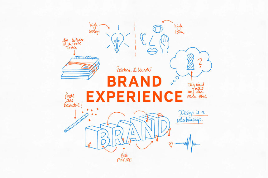
Edenspiekermann’s chief creative officer Paul Woods warns that traditional branding agencies need to face the fact that a primary brand mark is no longer the logo — instead it’s the experience.
“Brands will be differentiated through micro-interactions, such as gestures, sounds, and even how utility copy is written,” he explains. “For example, Slack is a masterclass on how a product brand voice is defined through details, like error message copy or even updates to change logs in the App Store.”
Brad Weaver agrees and reckons that content strategy will at last get a seat at the table.
“Content marketing and performance marketing are finally being seen for the problem-solver that they are in social media and UX, and that will bleed back into web design this year,” he predicts. “As the homepage dies off, navigation is slowly melting away, so that sites are consumed based on context and use case, and it’s going to take a skilled hand to ensure that the right content is displayed at each step. The value of content strategy really can’t be denied at this point, and it’s going to be a big part of the meaningful sites you see come out this year.”
12. The power of storytelling
One way to create a consistent brand and user experience to drive engagement is by means of an impactful story.
“Savvy design, product, and engineering teams are starting to pick up on what marketing and sales teams have been exploring for a while: storytelling matters,” points out Donna Lichaw, author of The User's Journey: Storymapping Products That People Love.
They realize that the products they build are more than just pixels and code, and that they have a unique opportunity to ‘build’ a story for people to experience.
“Products are a part of much larger, powerful business and customer stories — stories that can be developed with as much care and intent as UIs or design systems or the actual product itself,” Donna argues. “In that story, your customer is your hero, and your product is their sword. The better the sword, the better the story. The better the story, the more successful the product, the business, and the teams building that product.”
Here’s to 2018
There are many more trends that could be added to this list (for example, floating navigation menus, bold typography, inventive use of colors, biometric authentication) but many make these lists every year.
The main thing to remember is that modern web design isn’t focused on websites anymore, whether they’re accessed on mobile or desktop. Designers now have to see the bigger picture, and make decisions on what trends to follow — or take inspiration from — and what kind of techniques to apply based on how they affect the experience (and the brand) as a whole.
We can’t wait to see how the above trends will push digital design forward this year.
Thanks to Shopify