Web technologies that (thankfully) died
Here are a few items that were once all the rage. In hindsight, they turned out to be clunky technologies that were once a necessary part of our job.
Hard as it is to believe, it’s been over 20 years since the World Wide Web has become a mainstream part of our collective culture. It has played a major part in changing how we communicate and how we work. There aren’t many aspects of our lives that haven’t been changed by the web and its seemingly limitless collection of information.
As for designers, we’re certainly thankful for the role the web has played in our lives. It has provided us with a means to make a good living, after all.
But, the web can be a very trend-obsessed place, especially when it comes to technology. It has always been difficult to keep up with all the latest must-have bells and whistles that clients are asking for (even if they weren’t so great). The past is littered with examples of gimmicky “features” that we implemented and limited technologies we’ve had to work around.
Here are a few of those items that were once all the rage. In hindsight, they turned out to be clunky technologies that were once a necessary part of our job. While you might still find a few examples of them in the wild, they are rapidly becoming extinct.
PROPRIETARY CODE AND FORMATS
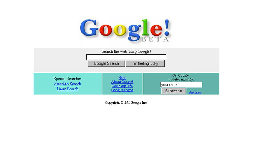
Back in the 1990’s, as use of the web was rapidly growing, companies were aiming to create websites that were more entertaining and consumer-friendly. There were a plethora of new browser plugins and companion software that allowed for this. What stood out, though, was that a lack of standards meant most of this technology was closed and proprietary.
MICROSOFT LOOKS TO WIN THE BROWSER WARS
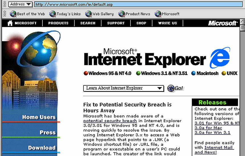
When Microsoft Internet Explorer launched back in August of 1995, its main competitor was the upstart Netscape Navigator. The software giant from Washington State was looking to put Netscape out of business and dominate the market share for browsers.
Among their many ideas was to create proprietary, non-standard HTML that would work only in IE. That led to sites that could look radically different in other browsers. As it turned out, many designers weren’t keen on using code that rendered their site useless (or just plain ugly) for a significant chunk of users.
MULTIMEDIA CHOICES
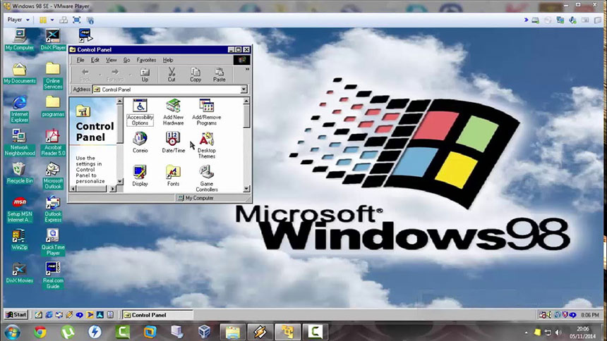
Both video and audio formats used to be a complete mess. Well before HTML5 standards allowed browsers to handle multimedia on their own, there were a bevy of proprietary formats and software needed to watch or listen to anything.
Setting up a site with any of this content meant you had to choose between competing formats. Plugins for QuickTime, RealAudio/RealVideo, and Windows Media Player were among the most-used. And, of course, they were in no way compatible with each other. So whichever formats you posted to a site, the end user had to have compatible software installed to access the content. What’s worse, using the RealAudio/RealVideo platform meant you’d have to install a server-side software package to enable multiple, simultaneous streams. This made live events quite costly.
Much of this also came at a time when broadband connections weren’t so common. While software companies boasted about their product’s ability to work well with very little bandwidth, the quality of streaming media was generally poor. Videos were tiny and pixelated, while audio (especially live streaming audio) sounded on par with a cheap AM radio.
FLASH

I know, Flash is still used a bit for video. But there was a time when Flash was the go-to platform for interactive media and animation. Just about any site that wanted animation, games, audio or video players would use the format.
Flash, in general, had a couple of fatal flaws:
1. Flash content was expensive and time-consuming to create
If you wanted to create original Flash content, you needed to buy an expensive software package (first from the original maker, Macromedia, then Adobe). It was several hundred dollars and had regular upgrades that weren’t so cheap, either.
The software itself was quite powerful. But it also featured a fairly steep learning curve. You needed a good bit of patience to create content because it could be a very long and drawn-out process. Simple animations that may have run in a user’s browser for 10 seconds may have taken a couple of hours to create.
Many a designer said a nasty word or two under their breath whenever a client requested some Flash content.
2. Flash was often relied upon too heavily
Remember the Flash intro? How about sites that were built entirely in Flash? Don’t get me wrong, there were some marvellously creative implementations of the format. But, in the wrong hands, it became a completely user-unfriendly way to create a website.
It almost became a way to dictate to users exactly what you wanted them to do, rather than letting them decide for themselves. Looking back, fatal flaw #1 probably led to #2. Designers knew they could charge a good bit of money for Flash development and so they sold it… often.
Flash eventually took on a new life as the preferred video platform for YouTube. However, Apple’s famous stance of not allowing Flash to run on iOS devices made that comeback rather short-lived. The Flash software’s legacy still lives on in the form of Adobe Animate CC.
LARGE STATIC SITES

Back in the day, a content management system (CMS) was something often custom built for a large corporation. That meant a lot of websites were built using good old-fashioned HTML. And, it could get awfully difficult to maintain.
Humor me as I take you through a couple of mundane things we do each day that used to be a true pain with a static website.
POSTING A NEWS ARTICLE
On a static site you would create a new HTML document using the proper template and add your content. Then, you had to manually add a link to the article in an index page or other listing. If you wanted this article to appear in a sidebar, you might have had to open up a server-side include file and add a link there as well. And don’t forget to upload these changes to the server.
With a CMS, you just add the new content.
CREATING A PHOTO GALLERY
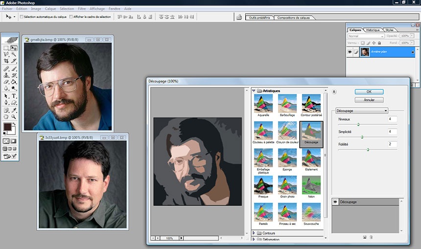
These were so much fun! Let’s say you needed to create a gallery with 100 photos. You would crop and optimize the photos with an image editor (full sized and thumbnail versions), setup an HTML layout (most likely using a table) for the gallery page. Then, you had to either implement a rudimentary script to link thumbnails to full size photos, or create new pages for each photo.
Of course, a good CMS can do all of these things for you while you’re in the next room drinking coffee. Automation is a beautiful thing!
LEST WE FORGET
While the web technologies of yesteryear were often cumbersome, they were also very important precursors to what we have today. If not for the pain points caused by so many proprietary media formats, we may not have the goodness that is HTML5 or other W3C standards in general. The backlash against Flash certainly helped shepherd in the widespread use of minimal design. And the lack of automation from static sites led to the development and democratization of the open source CMS.
Even though the old tech died out (or is really close to it), at least we can say that its existence made things better for us all. The progress we enjoy simply wouldn’t have been possible without them.
Thanks to Webdesigner Depot