Why is Whitespace in Web Design So Powerful?
Whitespace, also known as “negative space”, is the space in a design occupied by nothing other than a background colour or a faint background image.
Whitespace, also known as “negative space”, is the space in a design occupied by nothing other than a background colour or a faint background image.
Not every space in a design needs to be filled, and this is true whether we’re talking about designing leaflets or designing user interfaces. In fact, empty negative space can help make an important element stand out, and this rings true not only for desktop websites, but for apps and responsive mobile websites too.
“Less is more.” ~ someone wise.
Let’s take a look at 5 common design elements that can be improved by optimising the whitespace that surrounds them.
1. Bold Statements (Marketing Headlines)
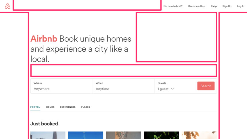
Part of what makes a bold statement (like a catchy marketing headline) so effective is the fact that they create more impact when they’re short and sweet. We can create boost this impact even further by reducing visual distractions on the screen. When a bold statement is surrounded by whitespace, the brand expels more confidence — this is the reasoning behind the very popular “big header” trend. When there’s “too much going on”, it can seem like you’re trying too hard.

2. Buttons/CTAs
Buttons and CTAs (call-to-action’s) are what designers usually spend the most time on, because those are the elements that marketing teams tend to care about the most (and rightfully so, websites and apps are all about converting, right?).
Problem is, most interfaces allow multiple ways to convert: newsletter subscriptions, customer signups, e-store checkout. Many websites and apps tend to thoughtlessly bundle these into every nook and cranny, but in fact, a well-timed CTA can be far more effective than a series of randomly inserted ones.
We can boost conversions by using CTAs intelligently, making them stand out by using an appropriate amount of whitespace. Place them in the user’s line-of-sight, such as after a headline or bold statement — call-to-action's should round off the content nicely and weave into the natural reading flow.

3. Content
Content design could quite possibly be the most neglected aspect of website and app design. So many designers forget about the spacing between various text elements in a layout (paragraphs, headings, lists, images, blockquotes, captions, etc), and where it’s becoming harder and harder to steal and retain the visitor’s attention, we really can’t afford to skimp on content design. Content is king!
When text elements are forced too close together, or when each line spreads too wide on the screen, the readability of the content is impaired. Optimising the user experience is aimless if ultimately the content isn’t easy to take in.
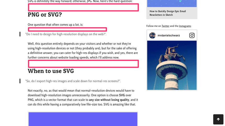
Designers need to ensure that the amount of whitespace surrounding elements of content allows the reader to digest the content at a comfortable pace (i.e. the amount of whitespace between text elements should reflect the pauses that the user takes when reading, otherwise the reader will grow tired very quickly).
4. Forms
Forms have a notoriously bad reputation. People simply hate filling them out, and will avoid doing so at all costs. However, we can use whitespace to make forms appear both short and minimal, making them appear less daunting to interact with.
Added whitespace around the overall form component will reduce visual distractions — it lets the user focus their attention on filling out the form while making the viewport feel less cluttered. Reduced whitespace between the individual form fields will make the overall form look smaller and more compact, and thus the user will perceive the form to be shorter (this only works if you’re applying minimalist design techniques, otherwise they’ll appear cluttered).
Forms are usually confusing and frustrating for users, and they can look especially unnerving when they extend out of the viewport (“OMG, how LONG is this form?!”). By making forms minimal, compact, and with enough room to breathe, we can increase form-based conversions. If you’re interested in learning more about form design, here’s 4 ways that you can improve forms.
5. Dividing User-Intent
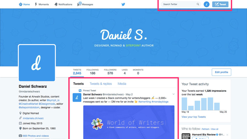
Layouts should be divided by user-intent — let’s take Facebook’s newsfeed for example. A user looking to change their privacy settings would avert their eyes to the top-right corner because that’s where all of the setting-related options are. A user looking to discover content would avert their eyes to the newsfeed itself because that’s where that content is displayed.
Content should be divided by what the user might intend to do. When a website or app offers an optimal user experience, the user “learns” how to use the interface by interacting with the tools and features that they need, but when searching for something previously undiscovered, they make smart assumptions of where that tool or feature might be. We can use whitespace to create a clear divide between the different user intents, to help users find the right feature in an orderly fashion.

Whitespace dramatically improves user experience by enhancing a minimalist design. The web is becoming cluttered with ads and visual noise that steals attention and focus from the user. By using whitespace smartly, you're helping the user navigate easily through your site, creating a pleasant experience, thus, a happy user that stays longer on your website, reducing bounce rate and possibly a returning customer or visitor.
Rounding off: how much whitespace is too much whitespace?
When it comes to whitespace, the only rule is that you should use your gut instinct. There is no fixed or variable amount of whitespace that you need to use — it comes down to the layout you’ve implemented and what feels “right” to your eyes. Put yourself in the shoes of the user as you design, and think:
- “Are these elements too close together?”
- “Is it easy to read the content?
- “Can I concentrate on the task at hand?”
- “Are there too many distractions?”
- “Would more whitespace let the design breathe?”
Follow your own intuition. Be mindful of the user.
Thanks to Sympli