Why a good User Experience is an overlooked SEO strategy
Your content is a well-cooked piece of meat, but to enjoy the meal, your users must also have the proper table settings
SEO almost invariably revolves around content. To talk about SEO is to talk about social media, keywords, backlinks and so on. That's all well and good. But in my opinion SEO has another side: the user experience.
Think about it this way: Your content is a well-cooked piece of meat, but to enjoy the meal, your users must also have the proper table settings, furniture and surroundings. These are akin to the user experience: Very few people are going to dig into your meal without plates or silverware, let alone a table or chair.
In order to support my emphasis on the user experience, I can cite various case studies. What works? What doesn’t? How can you implement a better user experience, and thus pull in the benefits?
Site speed
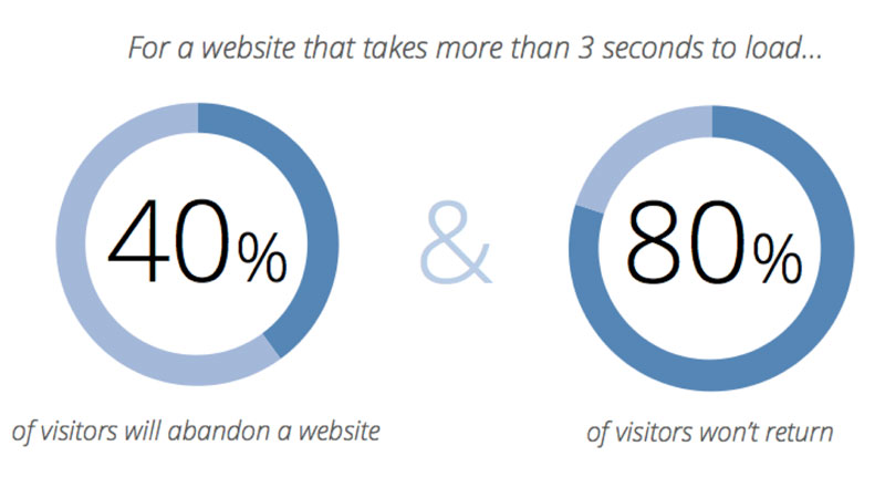
Site speed is undeniably an SEO factor, and it’s a huge part of the user experience. Studies conducted by Akamai and Gomez.com indicate that users expect a fast load time, and that a slow load time increases bounce rate, decreases conversion rates and lowers the time spent on the site.
One particularly good case study regarding site speed comes from Smashing magazine, which examined its own redesign. The redesign was a complex undertaking which included heavy changes to both the back end and front design of the site. You can read about the numerous changes the magazine made, but the results speak for themselves.
“By deferring and caching web fonts, inlining CSS [cascading style sheets] and optimizing the critical rendering path for the first 14 kilobits (kb), we were able to achieve dramatic improvements in loading times,” the magazine noted. The redesign's principals measured, reporting that the changes had taken the site down to 700-millisecond (ms) load times, with the height of a single second for the initial load." Using Google’s PageSpeed measuring tool helped lessen load times as well, on both desktop and mobile devices.
Mobile-first design
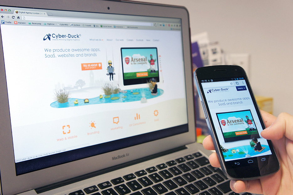
One thing mentioned at the start of the Smashing magazine case study was that project's emphasis on mobile-first design. With 80 percent of today's users browsing from smartphones at least some of the time, it’s absolutely critical to have a browsing experience that caters to those users.
The problem Cyber-Duck solved was the need to support a wide range of devices, from PCs and laptops to tablets, smartphones, ereaders and phablets. Doing this with anything other than a responsive design requires using numerous, separately maintained individual sites, with all of the URL, code and content expenses that entails.
What results did Cyber-Duck manage? Switching away from a CMS to a PHP framework improved server speeds by 3,900 percent. Optimizing images cut back on file sizes by 50 percent or more, depending on the image. And by letting content determine which segments should load, and specifying when and where, Cyber-Duck created a responsive design that fit on any device.
Overall, mobile traffic doubled, with an 82 percent increase in all traffic. Visit duration increased 18 percent, and the home-page exit rate dramatically decreased: to minus 4,000 percent. All of this happened due primarily to the combination of mobile users’ willingness to stay on-site and Google’s preference for pages that cater to mobile.
Streamlined homepage
Continuing with Cyber-Duck's redesign, the next step was content presentation. The company used content to define when and where its responsive design would break and resize, to fit various devices on a content-first basis. Let’s look at other ways in which content can drive design.
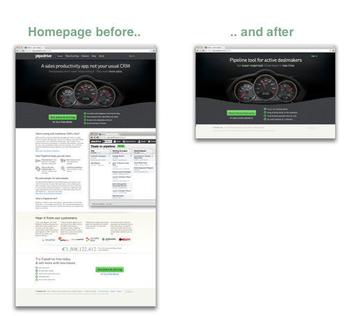
Specifically, we'll look at four cases compiled by Conversion XL. Four of these cases show sites where the home page was quite long. These home pages were full of valuable content, but arguably a home page is not the time or place to deliver that content. By cutting that content and moving it to dedicated informational pages, these sites were able to boost their click-through rates significantly. Depending on any given page's individual objective, CTRs increased from 5 percent to 143 percent.
Another example comes from the redesigns of SEO marketers Moz and Crazy Egg, which both dramatically expanded their home pages. This is where the information age catches up to us; visit Moz.com or CrazyEgg.com right now, and you’ll see short home pages. Earlier, lengthier pages worked for those sites. Now, the shorter pages are ideal.
It’s all about presenting the right information at the right time. Most users visit your home page with the expectation of moving on to subpages for the information they want. Thus, they search for links to those pages, which you give them. From an SEO perspective, a shorter home page results in less content to rank with, but splitting that content off offers more highly targeted informational pages to complement your site.
Call-to-action presentation
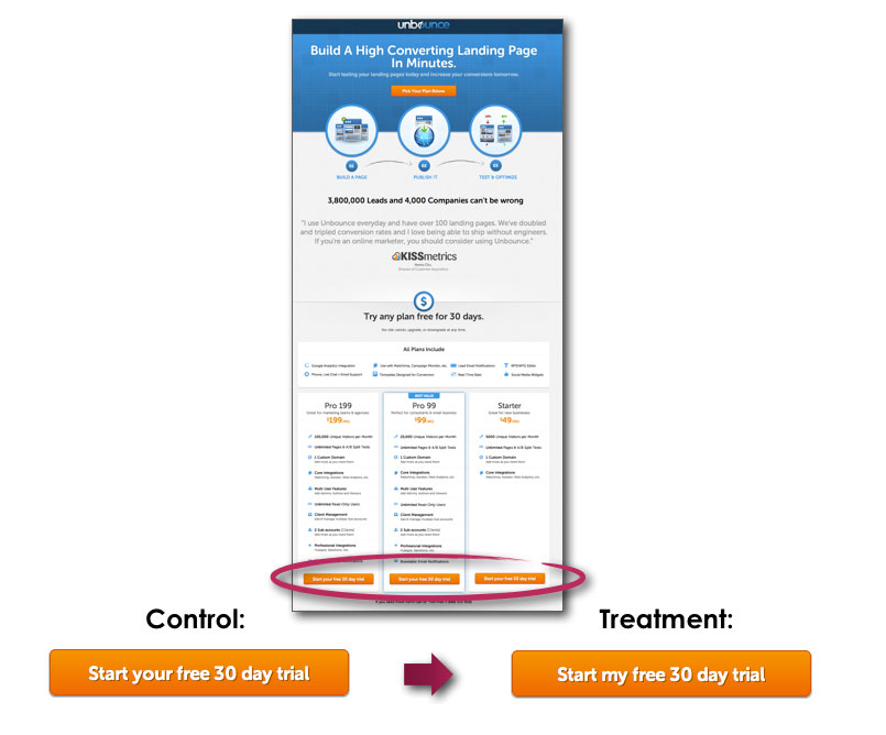
Our next topic is a call-to-action (CTA) for optimization. Ten different studies from Convent Verve illustrated multiple points, testing reverse changes to verify the results. Here are three changes, and the results they brought about:
1. Changing the language of a CTA button from “Start your free 30-day trial” to “Start my free 30-day trial” made the message more direct and personal, and resulted in a 90 percent increase in the click-through rate (CTR). The opposite change on a different page -- “my” to “your” -- decreased conversions by nearly 25 percent.
2. Adding value to a CTA button by making the copy more specific and relevant to what the user would be looking to do at that moment resulted in a 213 percent increase in CTR.
3. Positioning the CTA box in a better place -- in this case, at the bottom of a page below the fold -- drove 304 percent more conversions. This was the primary takeaway: By presenting the CTA at the end of the content, when the user is most likely convinced and ready to act, conversions increase.
You can also find interesting information about color, contrast and button size among those case studies. As for SEO, Google doesn’t much care about the color or relative positioning of your CTAs, but it does care that you have a well-designed site that will engage and assist your users.
Content presentation
Finally, there is the website's content itself -- what you find in blog posts and news articles. In this case, the study we looked at was less about cost than it was a scientific experiment. The Nielsen Norman Group performed an experiment in readability and information retention comparing a particular piece of content and four variations of it.
The original content was long and formatted, with nothing breaking up the pages. A rewritten version was trimmed significantly. A scannable version was created, with bold, formatted-on key phrases, as well as lists to highlight important statistics. Finally, an “objective” version was created to remove promotional text from the original altogether.
To establish the viability of the test, evaluators were given a questionnaire and asked to retain information from the text. In all cases, the versions with various enhancements in readability took the evaluators less time to respond to, with fewer errors and a higher satisfaction rating. Overall, the site's designers determined that the usability of the technical white papers increased by 159 percent.
Clearly, then, a good user experience leads to satisfied users and satisfied search engines. Combining both offers everything a small business owner could want from SEO. The evidence speaks for itself.
Thanks to Entrepreneur